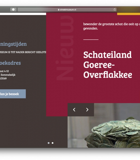
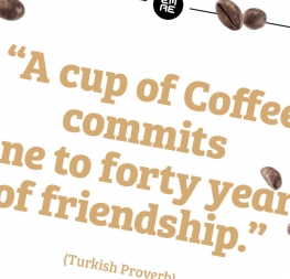
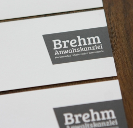
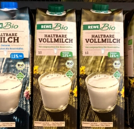
Bree Serif is an energetic and mature slab serif that maintains the original flavour of handwriting, and supports optimal editorial usage.
In 2008 TypeTogether released Bree, a spirited and rhythmic upright italic that quickly became a favourite among brand and editorial designers. All the personality is alive and well in José Scaglione and Veronika Burian’s Bree Serif, with the added benefit of working in more scenarios when paired together.
The Bree Serif font family is an energetic and mature slab serif — a separate type family in its own right — even though it follows the same theme as its predecessor. The characters in Bree Serif maintain the original flavour of handwriting and provide wider support for optimal editorial usage. The slabby nature of its shapes, particularly in the heavier weights, makes for a strong impression.
Bree Serif retains the uniqueness of its sans cousin, such as the single-story ‘a’, the cursive ‘e’, the rhythmic ‘k’, and the looped characters in the italic weights. Alternates of ‘a’, ‘e’, ‘g’, ‘k’, and ‘y’ are available in the upright styles when a more neutral look is desired.
As readable in text sizes as it is distinct in headlines, Bree Serif puts a pair of modern glasses on Bree’s face. The complete Bree Serif family, along with our entire catalogue, has been optimised for today’s varied screen uses.
Be sure to check out the sans family Bree, a spirited and rhythmic upright italic that’s ideal for display use.


