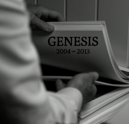
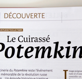
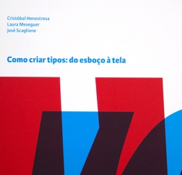
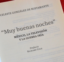
A highly legible and economic typeface, perfect for extended reading in editorials and newspapers.
Karmina is a text typeface created by José Scaglione and Veronika Burian mainly for pocket books and budget editions. It was built to withstand the worst printing conditions: low quality papers, high printing speed with web presses, and variations in the ink level of the printing press. The more opportunity for printing to go wrong, the more Karmina does to make it right — the right shapes, right sturdiness, and the right tone with which to approach the reader.
Some of Karmina’s most representative features are the rather large serifs intended to work perfectly in small reproduction sizes, the sharpness of the shapes, some calligraphic influences, and the large yet graceful inktraps in the acute connections. Structurally, Karmina combines a large x-height with relatively compressed letterforms to optimise space-saving. The cumulative result of these features grants Karmina outstanding legibility and economy, and the italic weights capitalise on the inktraps and calligraphic styling to easily set text apart from the roman.
The Karmina family comes in four styles, speaks multiple languages, and, along with our entire catalogue, has been optimised for today’s varied screen uses.
Be sure to check out Karmina Sans for a versatile and vivid companion to Karmina.


