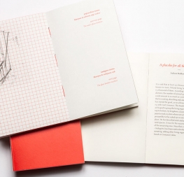
A contemporary, expressive serif with calligraphic nuances.
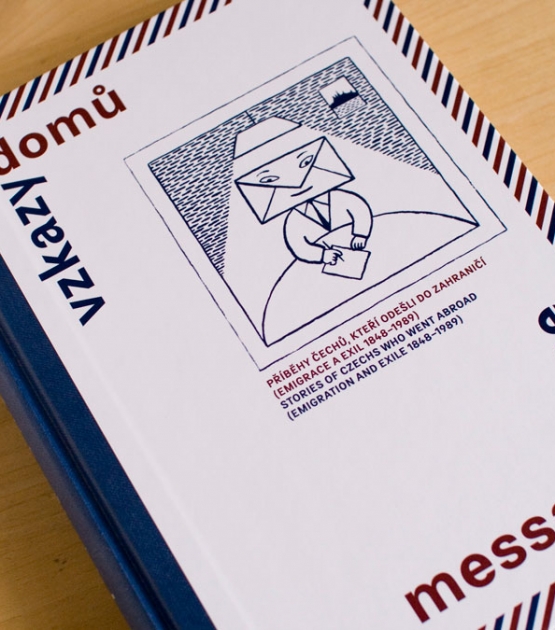
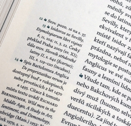
Inspired by early Czech type design, Veronika Burian’s Maiola is a contemporary typeface that is mindful of its heritage. Maiola creates a welcoming tension on the page by implementing oldstyle features and calligraphic reminiscences such as a humanist axis, modest contrast, and pen-formed terminals.
Maiola is intended for high-quality printed text and thus handles its expressive tendencies with care to equalise the important issues of legibility and personality.
Maiola’s expressiveness stems from the handmade feeling of the letterforms. To give the impression that it was etched rather than created digitally, its glyphs have purposeful and subtle irregularities which enhance its dynamic spirit. Hard breaks and sharp angles placed throughout each glyph reinforce the idea of handmade imperfections inherent to the technology of centuries past: strokes and serifs vary slightly in weight and shape; the rising crossbar of the ‘e’ opens the interior space; the foot serifs are asymmetrical in length and diagonally cut; each curve has angles injected; and the serifs along the x-height have diagonal and curved shapes.
Maiola’s italic styles take the expressiveness a few steps further, proudly displaying the sharp and cutting nature of the pen tool. It follows a similar spirit as the roman, but with greater stroke contrast and more brisk curvature and angularity throughout. Alternate capital letters are available in the italic to vary the feeling slightly while keeping Maiola’s inherent dynamism and liveliness.
Together these characteristics have a tangible benefit on the comfort and ease of reading and, though they remain subtle at text sizes, are commanding, pointed, and memorable when used in large headings. Maiola shows that each variation is perfectly in place — resolved in the best way possible to bridge tradition and progression without losing one bit of expressiveness.
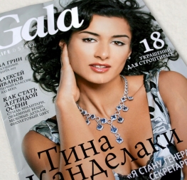
Maiola covers the Latin A character set with a broad set of opentype features, which is also included in Maiola Cyrillic, and Maiola Greek that covers polytonic Greek languages (Greek extension by Irene Vlachou). While each is basically independent from each other, harmonise well together in multilingual text settings. Maiola is more than able to bring high-quality expression to your projects with its six styles and exhaustive OpenType features. The complete Maiola family, along with our entire catalogue, has been optimised for today’s varied screen uses.
