De Telegraaf
April 2017
Abril Text, Abril Titling and Tablet Gothic in use in the Dutch newspaper De Telegraaf
Abril Text, Abril Titling and Tablet Gothic in use in the Dutch newspaper De Telegraaf
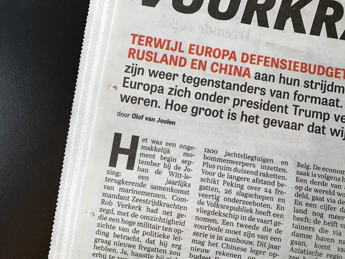
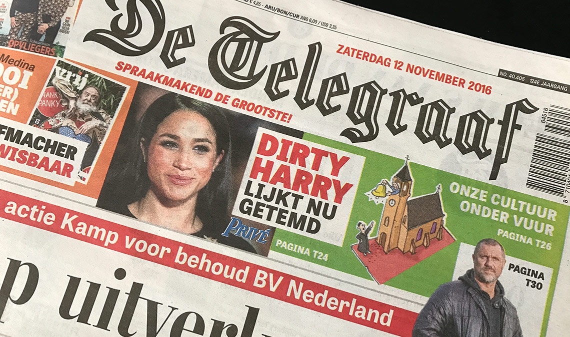
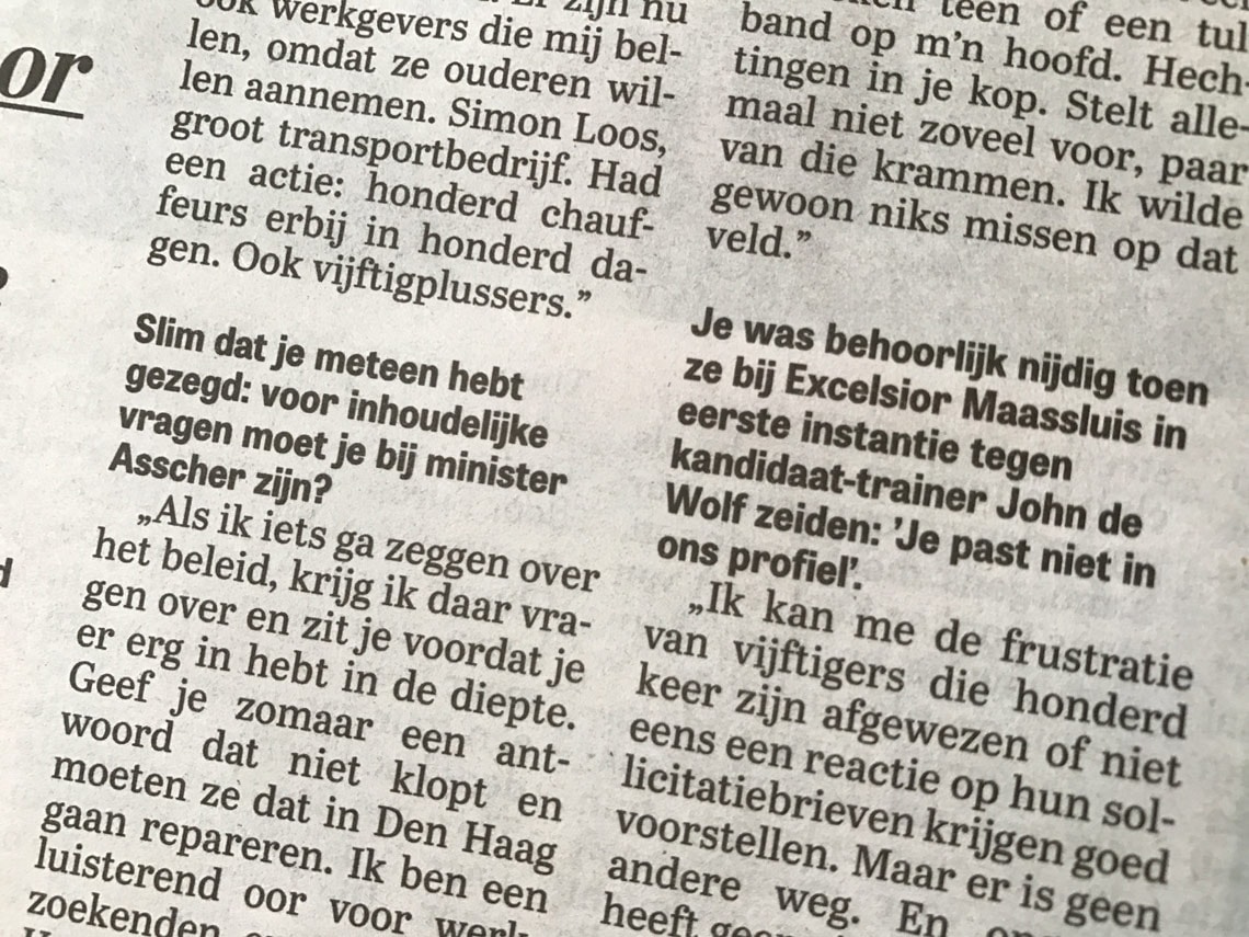
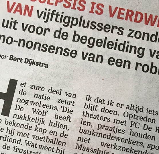
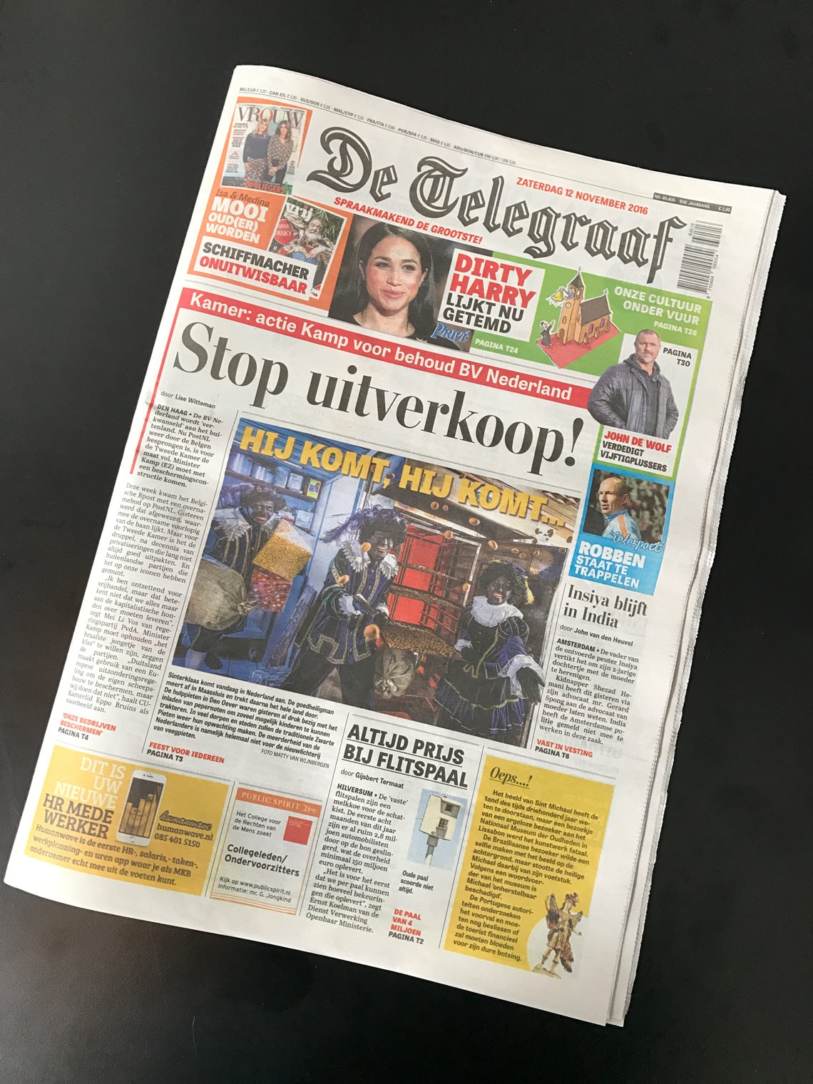
In 2012 one of the largest and iconic Dutch newspaper De Telegraaf went through a major redesign that included going from the traditional broadsheet format to a smaller tabloid.
The redesign was developed by the design team of De Telegraaf—Hans Haasnoot, art director, and Rig Hehenkamp, associate art director— and Garciamedia as consultants.
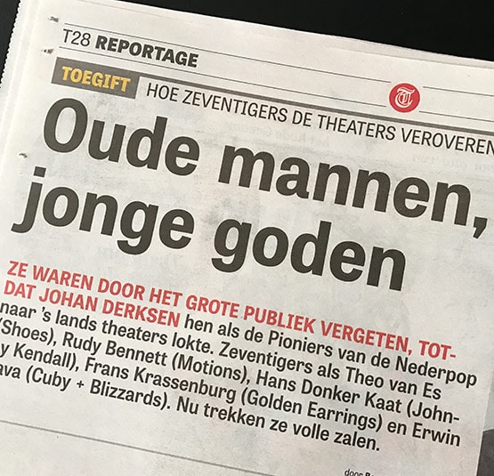
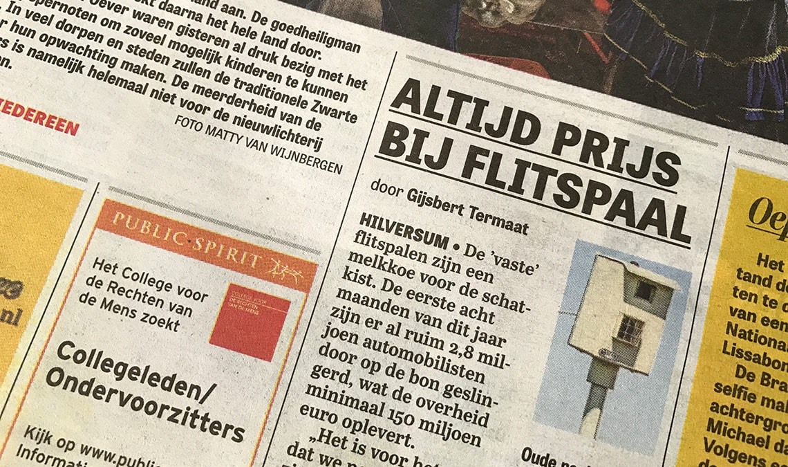
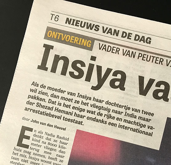
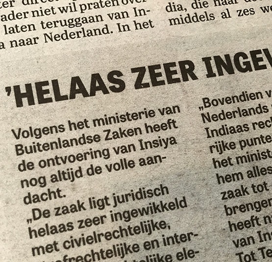
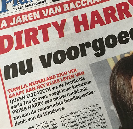
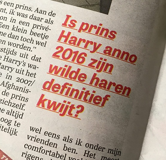
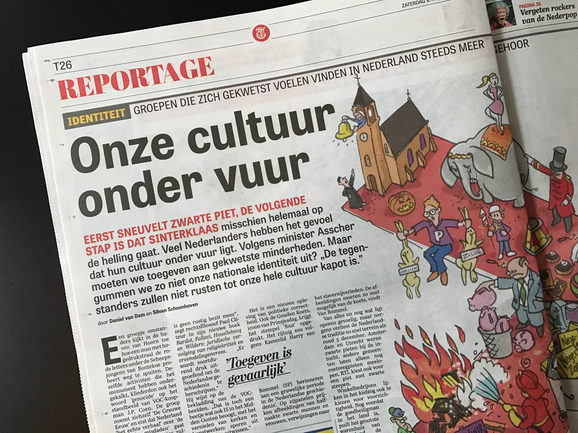
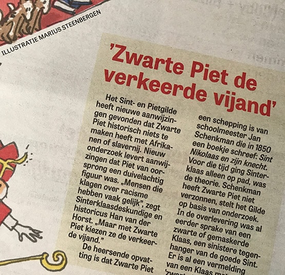
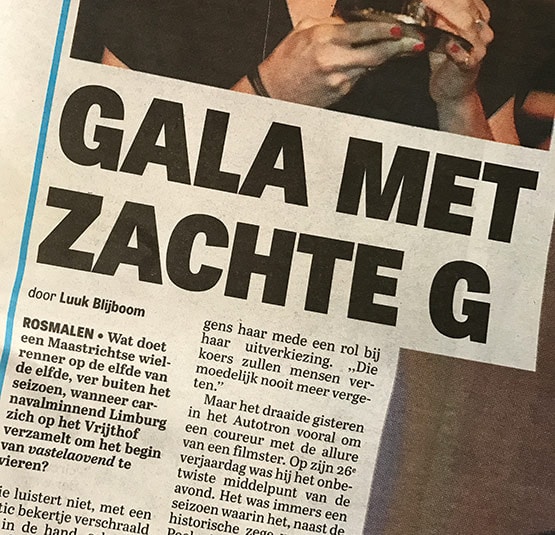
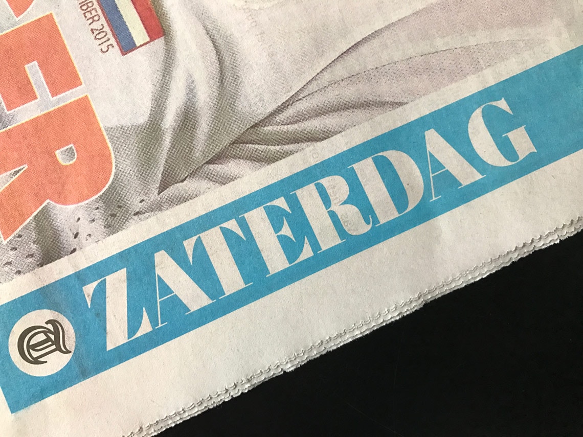
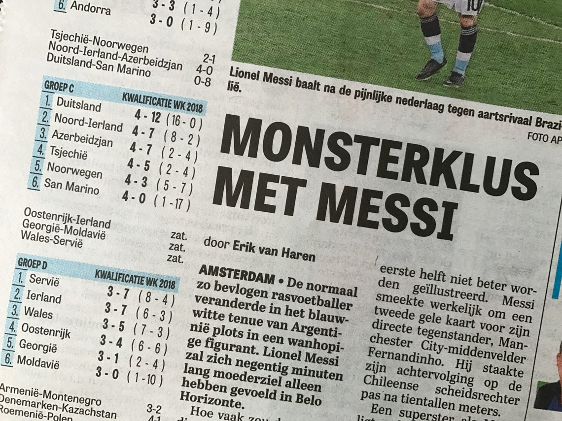
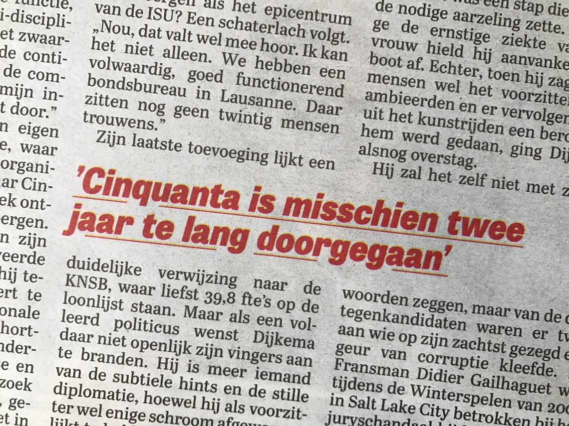
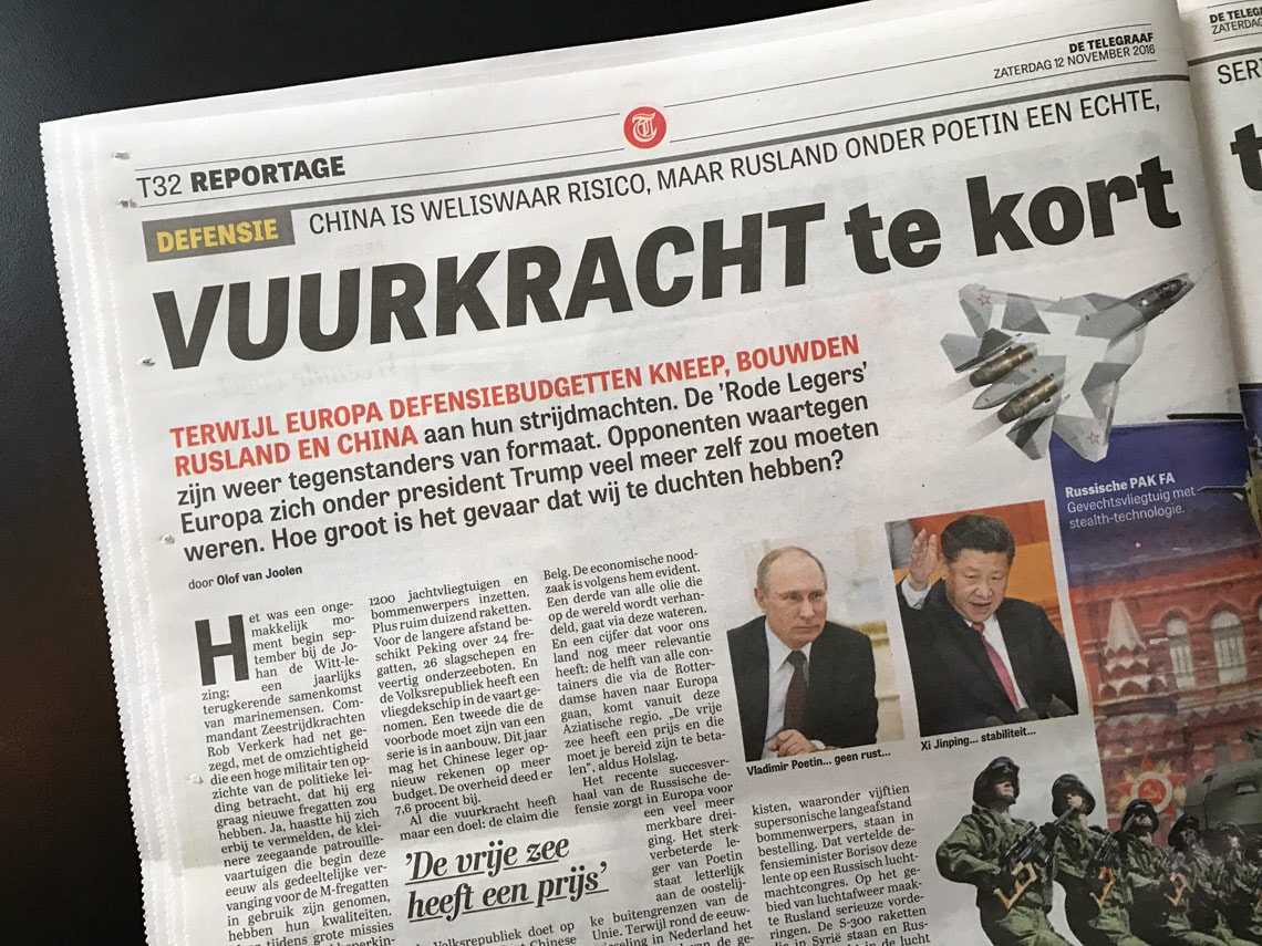
The new De Telegraaf uses a typographic palette that includes Tablet Gothic, esspecially for headlines, as well as Abril Text and Abril Titling. Tablet Gothic and Abril are a prefect match sharing proportions, texture, and a similar typographic language.
Garciamedia published a few articles about the redesign.
TypeTogether is an indie type foundry committed to excellence in type design with a focus on editorial use. Additionally, TypeTogether creates custom type design for corporate use. We invite you to browse our library of retail fonts or contact us to discuss custom type design projects.