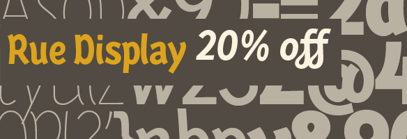
FONT CATALOGUE   |   CUSTOM TYPE   |   MORE NEWS   |   VISIT WEBSITE   
 

special offer
Editorial bundle


Although these two fonts were developed separately they have been combined with great success in a wide range of publications including England's Big Issue, Findland's Polyteekkari and USA's The Prepaid Press among others. Ronnia's 28 styles allows for great flexibility and can be used from titles to footnotes; Karmina's sturdiness grants excellent legibility for continuous reading even in the worst imaginable printing conditions. For a limited time,TypeTogether is offering an editorial bundle including Karmina and Ronnia, 32 fonts altogether.

GET THE EDITORIAL BUNDLE NOW!


SNEAK PEEK
Get ready for Abril!


Abril, the new typeface by Veronika Burian and José Scaglione is on its way. It is a font family engineered mainly for newspapers and magazines that features friendly and elegant styles for headlines and robust and economic styles for text. For the first time ever, we will be posting images showing the progress of the develoment of a font family. So stay connected to our Flickr group!

IMAGES AVAILABLE ON FLICKR


TYPE IN USE
Etica in Focus Magazine


The italian graphic design studio Leftloft was commissioned to restyle the best-selling popular-science magazine Focus, published by Gruner+Jahr Mondadori. They redesigned the masthead lettering and created a whole new visual style for the magazine. As secondary typeface Leftloft used their own sans-serif typeface family Etica, which was only recently published on our website.

SEE THE IMAGES


CUSTOM TYPE
Karmina Display


This display version of Karmina Regular was developed for a particular client with a specific set of requirements in mind. The client is using the full Karmina family for all their communication materials and needed a version for large size applications, as big as billboards. They liked the sturdiness and low contrast of Karmina and didn't want to loose those features too much in the display version. The contrast is rather low for a display version, but the overall feel of the typeface is elegant, slim and yet sturdy enough.

SEE THE IMAGES


Type in use
Oxford University Press


The Danish design studio 2Krogh AS choose Karmina and Karmina Sans as main typefaces for their project for the Oxford University Press. It is the new Oxford annotated bible for ecumenical studies. This big typefamily was very well used throughout the book in many different sizes and weights, fullfilling a variety of functions. It is a large volume of around 2000 pages printed on thin paper in excellent quality.

SEE THE IMAGES


NEW RELEASE
Rue Display


TypeTogether is proud to introduce Rue Display, an organic, casually ornamental, narrow-faced sans serif designed by Winnie Tan. Rue's spirited and exploratory design is the materialization of a feeling about fonts as a family of organisms taking on a life of its own, in work and play. It was conceived as a typeface, used as an image and discovered as an ornament. It comes in 5 weights of light, regular, medium, semibold and bold, each with matching italics.

GET RUE DISPLAY NOW SPECIAL
INTRODUCTORY OFFER: 20% OFF
- Use discount code 06d82d44