Typetogether - Newsletter
NEWSLETTER: MARCH 2017
LFT Iro Sans

LFT Iro Sans: Know where you stand

We are proud to announce LFT Iro Sans, the latest type family designed by Leftloft — and development by Octavio Pardo. A born leader, LFT Iro Sans began as the wayfinding project for San Siro stadium in Milan and was expanded into a branding typeface, as seen in the arresting unicase style. Since then it has been refined to work in editorials with two new display styles, additional weights, italics all around, and two pictogram sets for a total of 30 family members. LFT Iro Sans in an expansive rallying cry for enthusiasts of every stripe.


READ MORE

Athelas

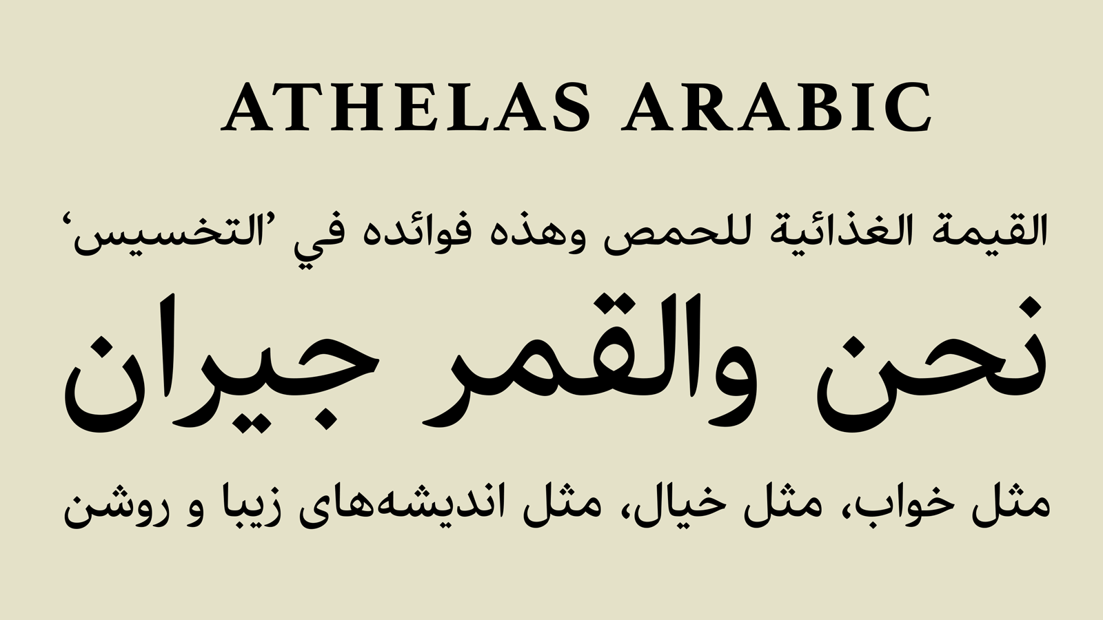
Sneak peek of Athelas Arabic

Athelas has a long history of setting fine digital and printed works in Latin, Cyrillic, and Greek. And very soon it will be able to set many forms of Arabic, including Persian, Urdu, Pashto, Jawi, Arwi, Sindhi, and Punjabi. Designed by the talented Sahar Afshar, an independent designer and researcher from Iran, the Arabic counterpart incorporates the elegant curves of the Latin typeface and avoids sharp edges throughout the character set. The graceful Athelas heritage has remained a hallmark in each script. With this release it will only gain a wider audience.


Promo

AwanZaman: Free Bold weight

AwanZaman, designed by Juliet Shen and Mamoun Sakkal, is the dual-script Arabic and Latin family for multilingual editorials and newspapers, though each script can stand on its own. Introducing more curved and novel forms in AwanZaman Latin cleverly brings its choppy strokes into greater harmony with the graceful, curved forms of the Arabic. And now you can try it for yourself. For the next two weeks grab the bold weight for free. Just use the code 7e4f5df8 at the checkout. (Valid until 28.03.2017)


READ MORE

Bely

Bely creates great space

Check out how Roxane Gataud’s Bely creates its own gorgeous, adventurous space in this video by motion design director Cecilia Brarda and animator Martín Campanella. While you’re in the Bely mood, Type Thursday did an interview with Roxane on the heels of her winning the top TDC award and it’s well worth reading. Check out the video and wish congratulations, once again, to Roxane. We’re so happy to be part of your stellar journey!


SEE THE VIDEO

Tablet Gothic

Type in use: Tablet Gothic

Sweden’s design culture is filled with restrained and impactful examples, but the Swedish Standards Institute (SIS) was not one of them. Via members from the private and public sector, SIS develops standards for everything from construction and environmental issues to engineering and healthcare. Appelberg, one of the largest agencies in Sweden, overhauled their magazine, called ‘Standard’, to give it a current look and clearer focus. By renaming it ‘S’ and choosing Tablet Gothic for use in headings, subheadings, and some texts, it brings a modern feel to an extremely wide range of subjects.


READ MORE
http://www.type-together.com/