|
Protipo fills more space
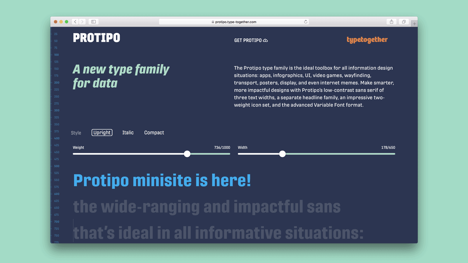
We’d like to announce Protipo’s own minisite, developed by Kenneth Ormandy with design input by Cesár Sesio and the TypeTogether team. Try out Protipo’s display style, its three widths, and its icon sets in a live web environment that you can control! Make the characters stretch to fill space, shrink to add more letters to a line, and perform the “jumps” as its internal space changes. When you’ve realised how well it can work for your information design needs, grab the licence to this advanced family.
Note: The minisite features work best in the latest operating system and the latest browsers, check if you are up to date to get the full experience.
GO TO MINISITE |
|
|
|
|
Discount, sponsorships & talks
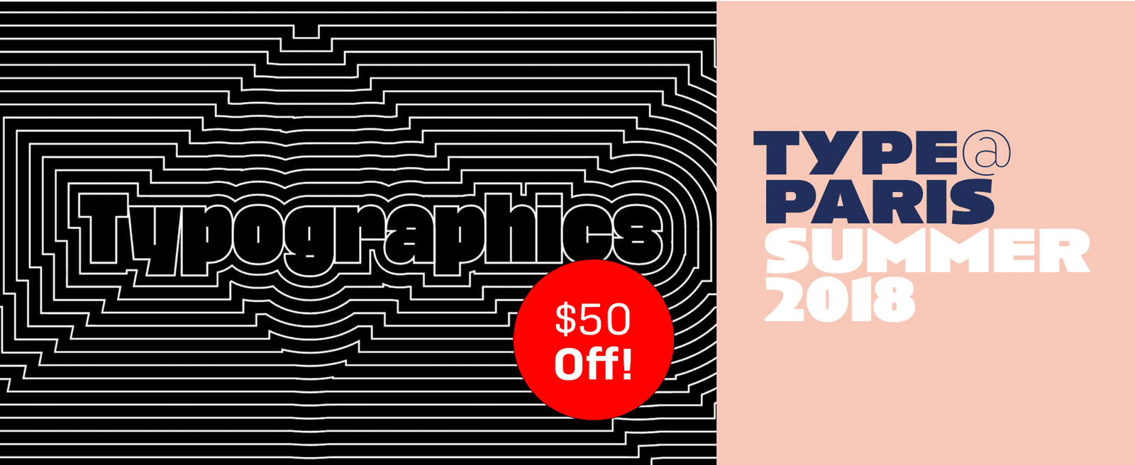
TypeTogether is again sponsoring some great events this summer. First up is TypeParis, and we’re guessing you can figure out where it’s going to be held. If you’re part of the TypeParis entourage, grab a Garalda specimen. Next is Typographics NY, and we’ll have brand new Leftloft catalogues available for this event. Not only that, but Veronika Burian and José Scaglione will be speaking there as well. And we have something special just for you. Use this code TYPETOGETHER_50 and you’ll get $50 off your Typographics ticket! This will work for individual professional, student, or educator tickets, but not the bundled tickets, alas. You probably know great people who would love this deal, so please help us promote the conference to your followers, friends, and clients.
READ MORE |
| |
|
|
|
|
‘Dichotomies’, a pop-up exhibition with Noam Text
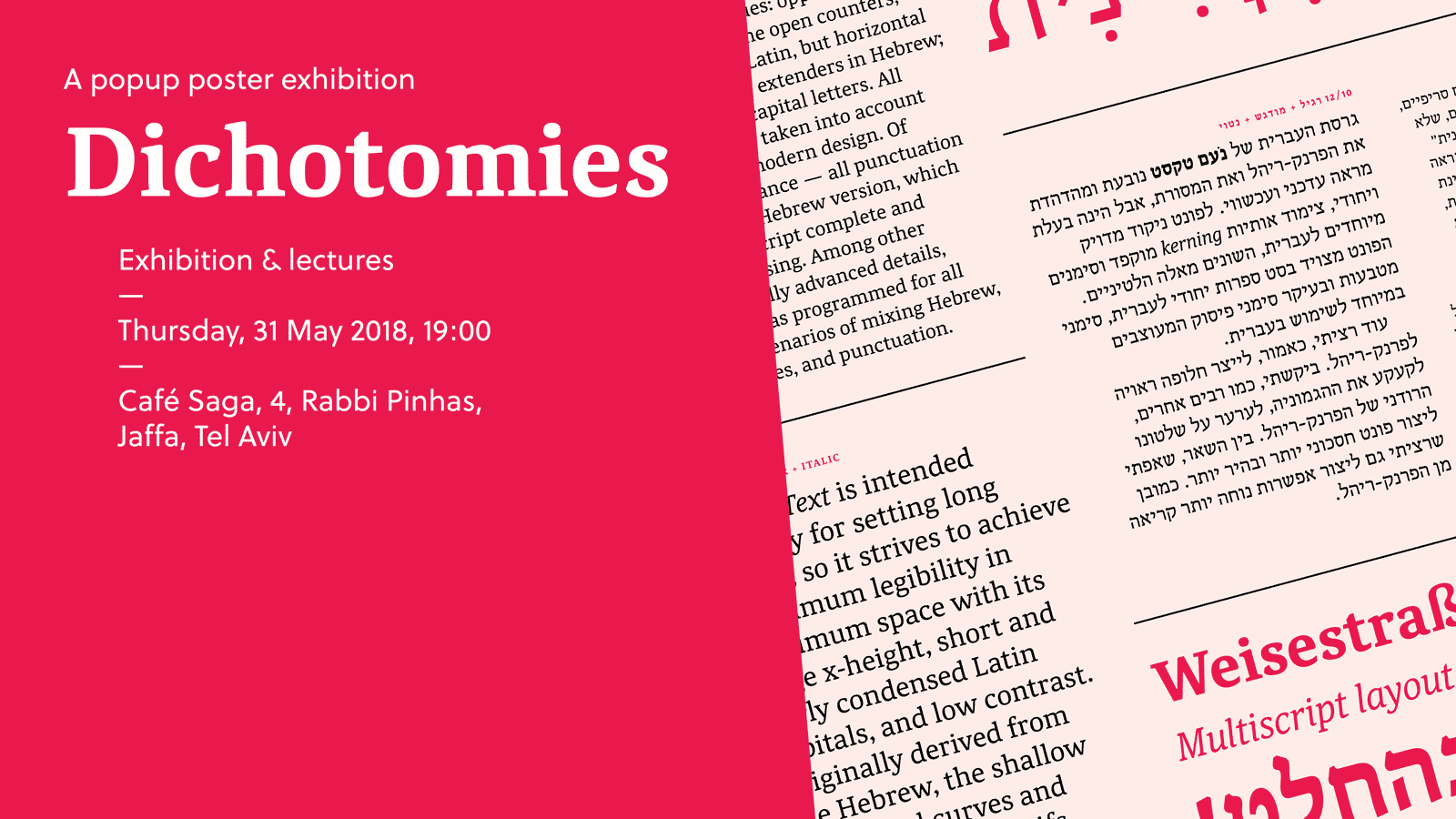
Tradition is something that remains throughout generations; and progress cannot be denied. We recently released Adi Stern’s Noam Text which aims to help bilingual Hebrew and Latin typesetting progress without abandoning tradition. To celebrate this achievement, the exhibition ‘Dichotomies’ is planned for 31 May 2018 in Tel Aviv. Fourteen outstanding designers have been invited to collaborate with a poster submission using Noam Text, and both Adi Stern and Veronika Burian will give talks at the event. Graphic designer Avi Bohbot has designed a unique specimen for the occasion that will be free for all those assisting with the opening. Interested in attending? We’d love to see you there!
READ MORE |
|
|
|
|
Type in use: Edita
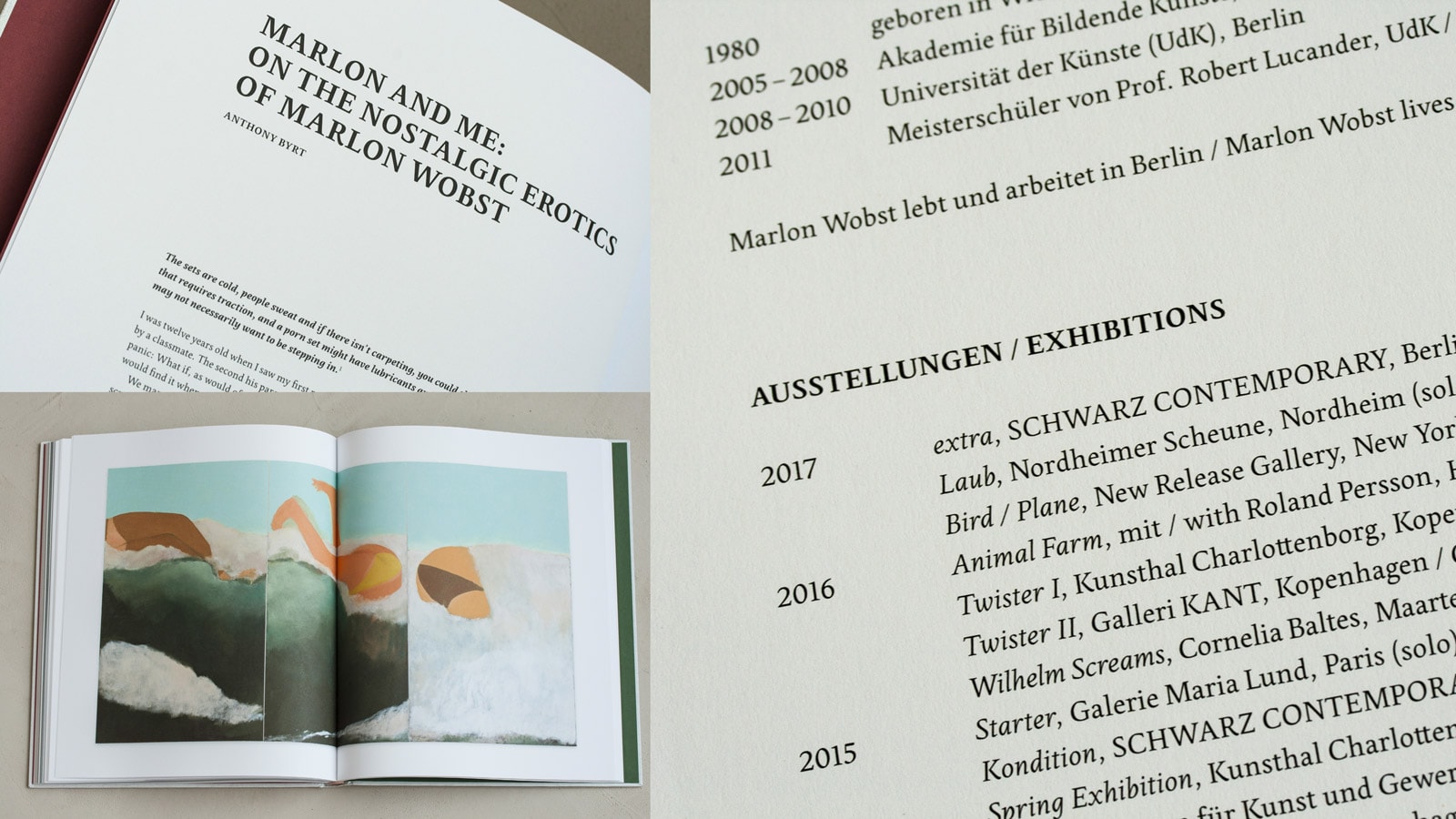
Pilar Cano’s Edita font family was made for books. It can support photography, get out of the way, and be assertive. It can appear smooth, be reserved, and jab you with a spiky serif. Book designer Verena Gerlach chose Edita for her recent Marlon Wobst book project for these very reasons. Want to know the other reasons and see how well Edita performs? Read this new Type In Use post. We love seeing our typefaces in the wild, so be sure to send us your examples of our fonts being used well.
READ MORE |
|
|
|
|
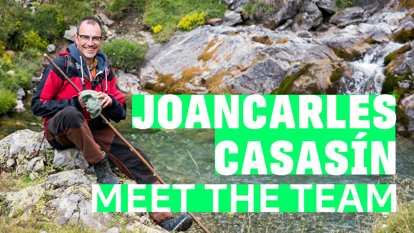
Meet Joancarles Casasín
Like members of a band, each of us at TypeTogether play an important part within the whole. Joancarles Casasín is our wrangler of code, our righter of wrongs, our hidden superpower. If a Python script can be written for it, then you can be sure he’ll have it done. Though he is reserved in demeanour, he’s one of several who are making sure the fonts we publish are of the highest quality. Get to know more about him in our team interview series.
READ MORE
|
|
|
|
|
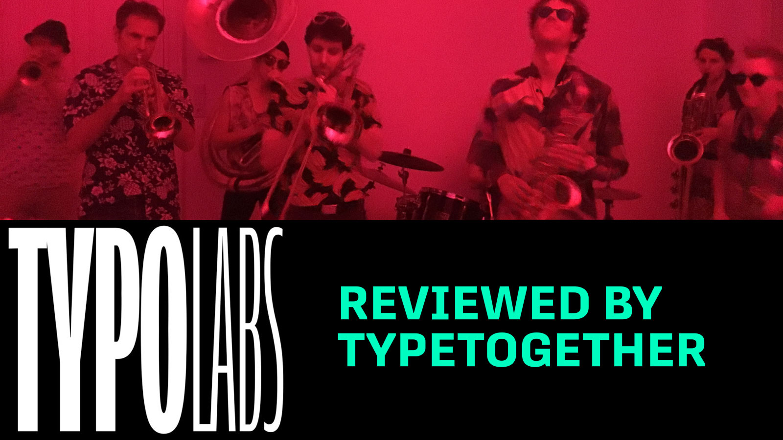
TYPO Labs 2018 review
Almost half of the TypeTogether core team attended TYPO Labs this year. It was an old stomping ground for a few of the teammates, but for others it was their first time. Veronika Burian wrote a post about what it was like as a first-timer and why this year’s refrain was again the Variable font format.
READ MORE
|
|
|
|
%%emailaddress%%

To stop receiving these emails:%%unsubscribelink%%
|