|
|
Ready for the closeup: Adelle Sans Devanagari
Adelle Sans continues to be one of the broadest multiscript retail font families available. It is a grotesque sans with a memorable look, humanist flavour, and was designed from the ground up by Veronika and José to be the best digital and analogue reading experience of its kind. Today we proudly announce Adelle Sans Devanagari, following its Latin, Arabic, Armenian, Cyrillic, and Greek siblings. Adelle Sans Devanagari expands the original family’s forms into a versatile tool for countless situations — branding, signage, paragraphs, and advertising. Celebrate with 400 million of your global neighbours! Check it out on the TypeTogether website and pass the word.
READ MORE |
| |
|
|
|
|
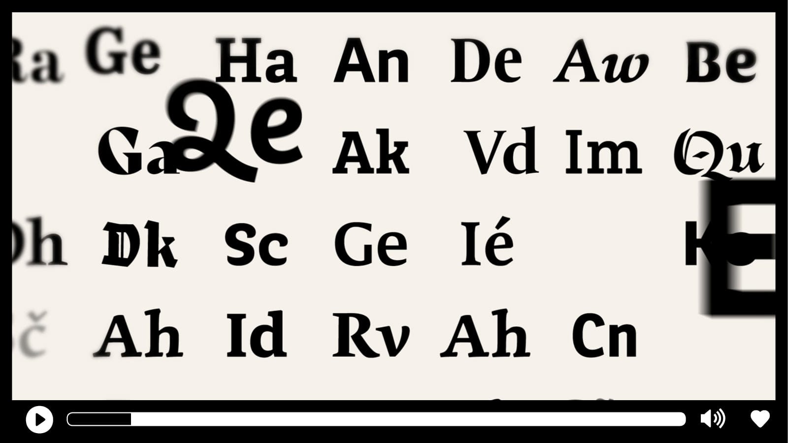
Video: Branding with fonts
Establishing a clear brand makes you noticeable, engenders trust, and can turn a one-time buyer into a raving fan. Since text is irreplaceable for communication, and since fonts give your communication a specific voice, what voice does your brand have? TypeTogether specialises in designing retail fonts that have a certain tone. We also specialise in creating custom typefaces that carry your unique values and elevate your brand’s voice above the crowd. We’ve done it time and time and time and time again, in many languages, and for every kind of media on which it will be displayed. Check out our new Better Brands video by Cecilia Brarda and send us an email to see how we can help create a distinct voice for you as well!
WATCH THE VIDEO |
| |
|
|
|
|
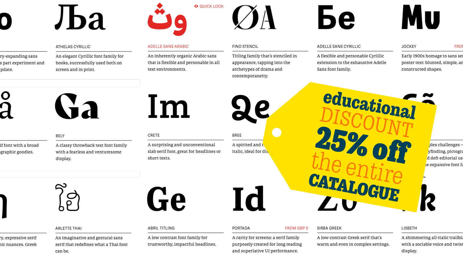
Education and NGO discount — always
We’ve been strong supporters of education from day one. It’s one of the things that make us who we are. So did you know that any individual or entity in the education and non-governmental organisation (NGO) categories receives a 25% automatic discount from us? It’s true. You’re committed to making yourself and your corner of the world better, so we’re committed to you. Any NGO, and any individual, department, or school automatically receives 25% off purchases directly from TypeTogether, whether it’s one font weight or our entire catalogue. It’s a simple two-step process, so send us an email to find out how. Happy discounting!
SEE OUR FONTS |
|
|
|
|
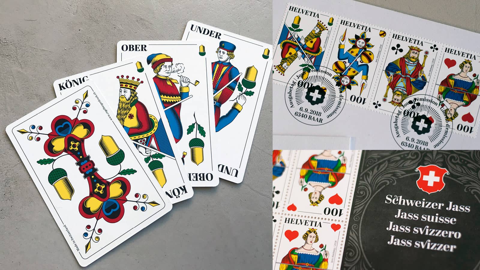
Type in use: Schweizer Jass card game & stamps with Abril Display
Modernising a beloved cultural institution is always a tall order. Creative director Jens Riedweg did just that for the popular Swiss card game, Jass, using brand new illustrations, perfect printing, and the Abril family. Moving from wood engravings to digital formats necessitated a complete overhaul, which meant designing everything from scratch, including choosing which fonts to use. The final result was so well received that a series of stamps were also made in its honour. Read about the process and the rationale behind the project, and how Abril became the voice of the new-is-old game.
READ MORE
|
|
|
|
|
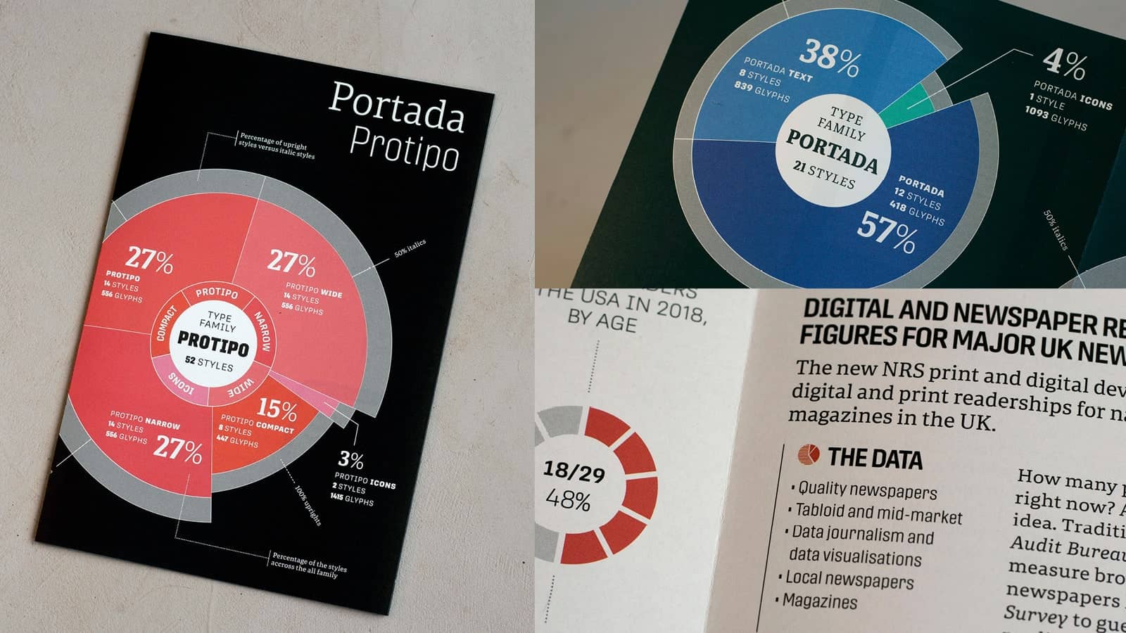
Fresh-pressed: Portada & Protipo specimen
Print ain’t dead — especially for those of us who love printed type specimens. Our newest trifold combines Portada and Protipo with screen renders and real-life stats galore. Those receiving Creative Review magazine will see it shortly and the rest of you can order straight from our merch store. We only charge a little for shipping, so skip one coffee purchase and use that cash for this expertly printed piece. Meanwhile, have you seen the Protipo Variable minisite? Mash the button to see the live Variable Font playground that you can control.
READ MORE
|
|
|
|
|
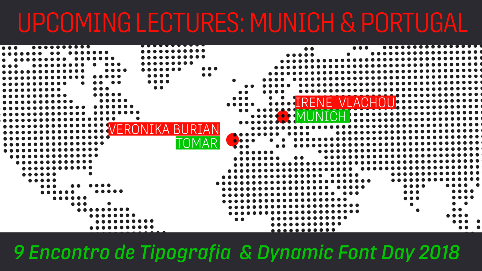
Choose your own adventure: Veronika’s futuristic keynote & Irene’s cutting edge talk
Portugal’s Encontro de Tipografia conference, also known as 9et, is themed around “thinking about tomorrow” and how typography plays into it. Veronika’s keynote presentation will discuss her passion for type design, her standards of excellence, the challenges posed in the marketplace, and what success might look like. In Germany on the same day, our own Irene Vlachou will discuss Variable fonts at Dynamic Font Day, from the planning stages to their release, as well as touching on their versatility and the confusion surrounding them. You won’t want to miss this opportunity to learn from two global authorities and two of our favourite colleagues at TypeTogether. The only difficulty is choosing which one to see in person.
READ MORE |
| |
|
|
|
%%emailaddress%%

To stop receiving these emails:%%unsubscribelink%%
|