|
|
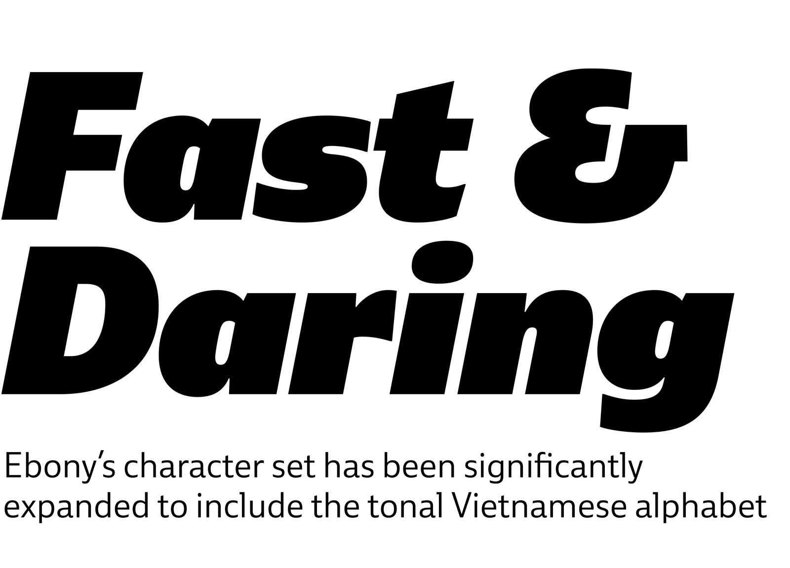
Some font families are squarely in one category while others attempt a remix of influences. Ebony is the second kind: part humanist sans serif, part grotesque, and all awesome. If you’re into sport, feel a need for speed, or want a modern family with all the bells and whistles, Ebony is the tire-screeching muscle car calling your name. Ebony is perfect for brands with a backbone and text with a tale to tell. And we just expanded it to include Vietnamese. Two weights are free so stop by the website type tester to try it for yourself.
SEE THE FONT
|
|
|
|

|
TypeTogether in Italy
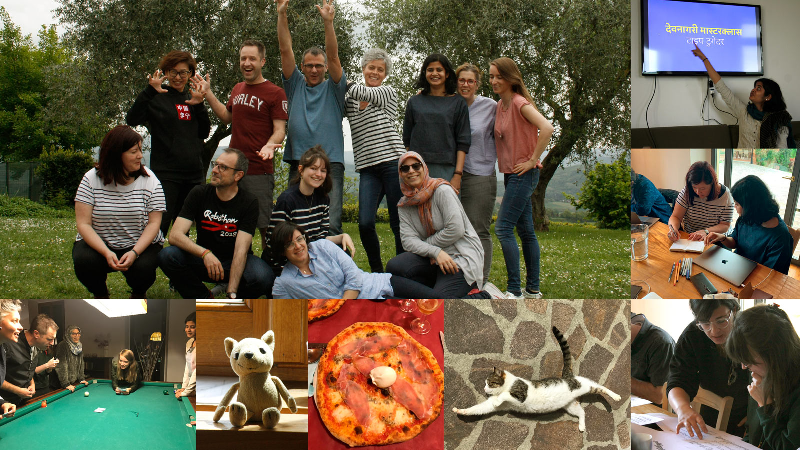
The core TypeTogether team meets together once a year to learn from each other, review the past year, plan for next one, and just have fun. This year we met in Vicchio, Italy, a picturesque mountain village that is a 45-minute drive northeast of Florence. Interspersed between conversations about how to improve workflow or serve a wider audience, our teammates ran three masterclass workshops: Devanagari, Arabic logos, and variable fonts. It was a great time of reconnecting and recommitting to what we all love — doing type, together.
READ MORE
|
|
|
|
|
|
|
Each year TypeTogether takes applications for our mentorship programme to help an emerging type designer bring their font family to completion. Florian Fecher won the award this year with his wide-ranging grotesque, especially noting the display weights that will be used in situations of extreme spacing, high-impact headlines, and identities. Our thanks to all who submitted their multilingual projects: almost 30 submissions covering more than nine scripts, and with a range of tone from the formal to the aloof. Congratulations again to Florian! Now comes the hard work. ;o)
READ MORE
|
|
|
|

|
Soleil focuses the Evernote rebrand
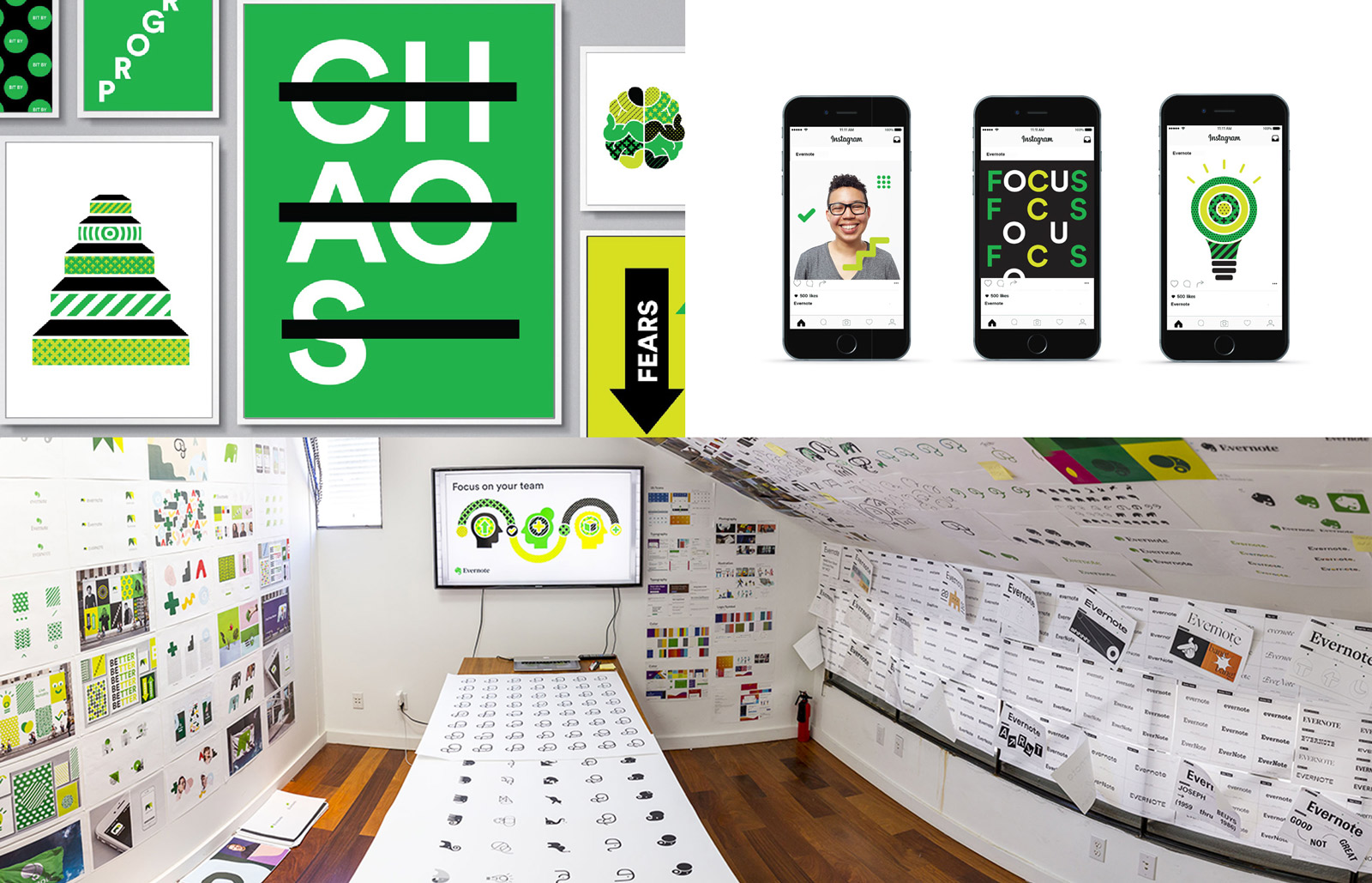
Evernote is the brand of focus. So what font family did DesignStudio choose when the rebrand options cover the walls — and the ceiling! — of the headquarters? Evernote had this exact problem and they chose our Soleil by Wolfgang Homola to be the focused voice of their company. With their updated logo and wordmark, refreshed colour scheme, and the value of remembering everything, Soleil sets them up for the foreseeable future. See it in action on their website, brand videos, and campaigns, then explore Soleil’s type tester yourself to see if it would work for your digital and printed brand.
READ MORE
|
|
|
|

|
2019 catalogue
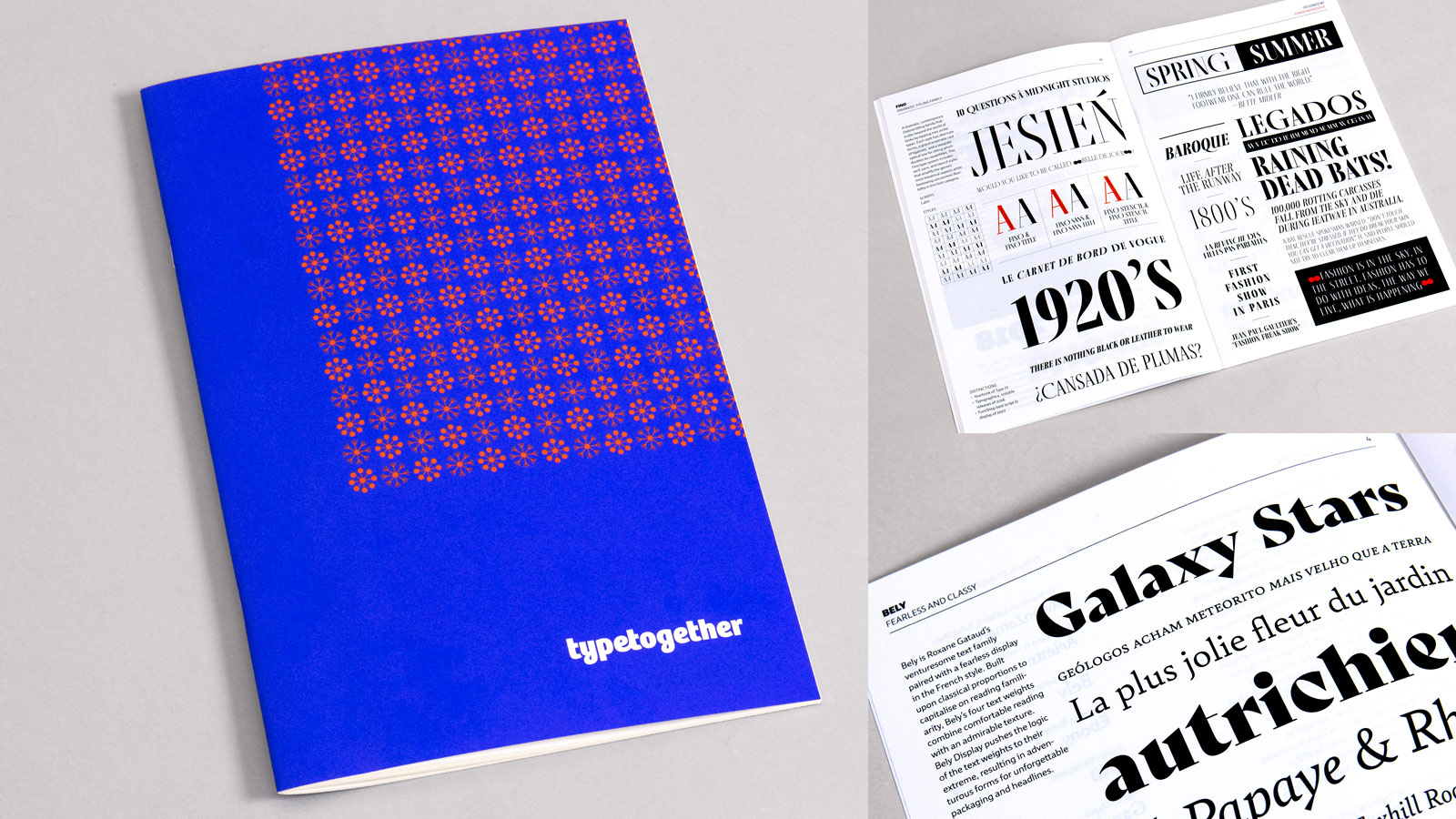
We publish a comprehensive printed catalogue every five years to show the type families that have been released in that half-decade (see previous 2009 and 2014). After a few months of prep, design, paper choice, editing, and sweating every detail, it’s finally ready. Introducing our 2019 catalogue: Arlette, AwanZaman, Bely, Ebony, LFT Iro Sans, Temeraire, and 12 more families in this 40-page beauty! As always, our catalogues are free of charge so it’s almost like stealing eye-candy from a baby. Pay only the shipping and this printed perfection is all yours. Order up!
READ MORE
|
|
|
|
%%emailaddress%%

To stop receiving these emails:%%unsubscribelink%%
|