Adding a century of lessons from geometric type design to Arabic’s calligraphic feel.
The Postea font family is Veronika Burian and José Scaglione’s take on geometric typefaces, reshaped as Postea Arabic by Azza Alameddine with the right attributes for setting paragraphs and headings, and perfect for branding and text use. The classic curves and purposeful details keep its individuality intact while allowing it to fit an incredible range of multiscript design needs. Because of these qualities, Postea Arabic makes normal reading in paragraphs a cinch and your branding memorable.
Postea Arabic’s main goal was to match the colour and rhythm of the family’s other scripts for a unified look amidst multiscript typography. A second goal was to provide a style for modern Arabic typography which combines geometric with handmade structures for a readable, familiar, and still novel family. Font users get all the benefits of the new with the comfort of the expected.
Compared to midcentury attributes of restraint and a sparse appearance, Postea Arabic’s deliberate play between character widths injects liveliness and distinction into its personality. Another nice surprise awaits: spacing for the Hairline weight is tighter for optimal use in large headings and titles, while the regular weights have the slightly looser spacing readers require for text.
Postea Arabic is opinionated and has modern stylistic sets with softer, specially-designed alternate characters. Wallpaper-worthy geometric symbols, arrows, and ornaments are packed into SS01 and SS09, and SS07 is reserved for Urdu variants. For the ultimate in customisation, the second and third stylistic sets are where geometric and typographic alternates are found.
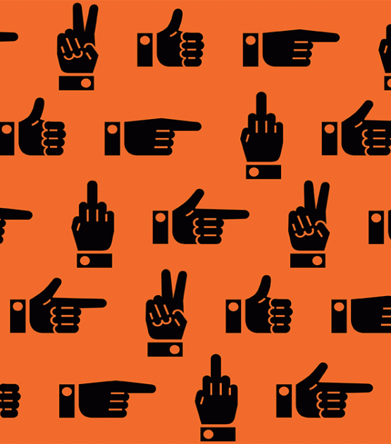
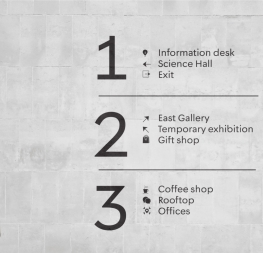
Postea Arabic’s seven upright styles or one variable font are accompanied by an all-new family of icons in three weights, for which we developed a new, easy activation feature. Simply bookend the desired icon name with colons (:arrowUp: :firstAid: :aid: :chargingStation:), making sure to capitalise each word after the first word, then select it and activate SS10. Icons include wayfinding, social interface, and sanitary precautions like face masks, thermometers, hand washing, and much more.
Postea Arabic is resilient in the number of ways the family can be used, and its recognisable characters make it a prime selection for branding, signage, corporate typefaces, and magazines. The entire five-script Postea family (Arabic, Cyrillic, Greek, Hebrew, and Latin, now including Vietnamese) brings simplicity and impact together nicely, invoking a balance between a constructed and human feel. Beginning with the design virtues of simplicity and restraint, Postea Arabic is the rational response for text — a lyrical take on geometric sans serifs.
CREDITS
Lead design and concept
Veronika Burian, José Scaglione
Type Design
Azza Alameddine (Arabic)
Veronika Burian (Greek)
Yorlmar Campos (Greek)
Vera Evstafieva (Cyrillic)
Tom Grace (Hebrew, Greek)
Icon Design
Luciana Sottini
Quality Assurance
Azza Alameddine
Engineering
Joancarles Casasín
Kerning
Radek Sidun (Latin)
Graphic Design
Rabab Charafeddine
Elena Veguillas
Felicia Priscillya
Motion Design
Cecilia Brarda
Copywriting
Joshua Farmer
Consultation
Meir Sadan (Hebrew)
Irene Vlachou (Greek)
Social media manager
Douglas Arellanes