Interview with Juan Bruce

October 2017

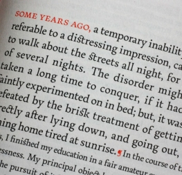
Some people’s paths are clear and straight, while others take several detours before they settle in. Juan Bruce is a traveller at heart, and now, with his release influenced by 17th century Dutch maps, Noort, he taps into that traveller’s spirit within the type world. Josh Farmer discussed Juan’s background, his process, and current research projects for an interview that highlights where research meets design.

Noort by Juan Bruce


Noort

You just released a fantastic type family through TypeTogether called Noort, and we’ll talk about that in a few minutes. But first, tell us a bit about yourself. You’re an artist or designer, correct?
I would say a designer more than an artist, but I believe type design is definitely an art. It’s a very crafty discipline. We must deal with patterns, drawing, visual rhythm, black and white shapes, and all sorts of artistic issues.


‘Cohen’ by Juan Bruce.


Khojki Specimen, Ismaili Printing Press, 1942.


Can you describe your path for us? What kind of schooling led you to end up creating fonts? And why are you attracted to type design?
My background is in graphic design, but before that I spent three years drifting between programmes in architecture and the art school. It was during my BA in Graphic Design when I found my interest in typography. I saw it then as something quite unattainable, reserved for experts. I see that this prejudice intimidates many from getting into type design seriously, but it shouldn’t be like that. It’s very rewarding.

Sometimes I’m a bit disappointed about the demands of graphic design, which too often only fulfils shallow requirements that are mostly conceived for short-term gains. Type design, on the other hand, besides the challenges it offers in complexity, is definitely an upgrade in terms of the contribution of your work to the rest of the world. It tries to fill voids within more concrete aspects of society, such as language and writing. I’ve enjoyed pivoting to this discipline quite a lot.


Process sample for Noort.


Noort, from early sketch to final digital font.


You graduated with a Master of Arts in Type Design (MATD) from Reading University in the UK. Tell us about the programme, the processes you went through, and the instructors you had.
I remember it as a great year in all respects. It was constant challenges, an elevated level of discussion, great teachers, and extraordinary friends. The programme is very practical, as it should be, with a big foot in academic research. The research portion was unknown to me, but I ended up fascinated and with great expectations to include research as an integrated part of my professional career. World-class teachers, such as Fiona Ross, Dr Gerard Unger, and Gerry Leonidas, encourage students to understand type in its context and to see typography beyond the practical skills you might develop. To me, that’s the central manifesto of the programme.
 

And did your illustration skill have any bearing on mastering the material?
My illustration style is rougher, and type design is concentrated detail. Drawing letters is no different than drawing anything else, but you judge differently. When evaluating your work, you must move to a broader discernment. Yes, in the end you illustrate letterforms, but with the intention that they function alongside other letters; it requires more attention. Your little creations need to behave as a team under firm and “regulated” reading parameters. That’s the major difference from other artistic disciplines — you must restrain your creativity within a very narrow margin of accepted conventions. The eye and your judgement become your main tools at the end, and they need time to be trained.


You’re married, right? Were you married during the programme, and how did you balance the school requirements with personal responsibilities?
Yes, we were married then. Vale enjoyed the UK quite a lot, though she wasn’t a fan of the early winter dusk. She did a lot of things on her own while we were there, but she also hung out in the department quite a lot. Even though her profession has nothing to do with typography, she seemed to fit in easily with the group and even enjoyed going with us to the Plantin Moretus Museum. So I would say for us it was not something difficult to balance. On the contrary, she was a great support and the best company.


17th century map detail — with sea monster — which served as partial inspiration for Noort.


THE PROCESS

One way your new type family, Noort, is being described is as a way to wrangle huge amounts of information that has multiple layers. Walk us through the process of creating Noort. How did it come about?
It was always a cartographic project. I saw great potential in the rough and fast lettering of 17th century Dutch maps, but then I began experimenting with functionality for truly small scales to the point of absurdity. I tried horrible ink traps and huge x-heights — good fun and interesting findings, but poor design results. Noort now has rather conventional proportions, but it still keeps resilient features. Some traits are better appreciated in larger sizes, so I think it could have great performance in editorial contexts as long as an extra point or two of leading is added. Isolated words, such as on maps or some information design layouts, are primary uses, too. But, as I said, I like the way it works in paragraphs, especially when combined with the italics.


Details of Noort’s design process, not final digital version.


Map detail showing topographical structures, italic and roman styles, and dwellings. These have also found their way into Noort’s character set.


TypeTogether awarded you with their second mentorship programme, the Typeface Publishing Incentive Programme. What was it like working with Veronika, José, and the rest of the team to refine your type family?
I think one of the things I learned is how trained eyes can spot issues in the design that you don’t yet see. I had that during the MA course in abundance, but I was even luckier to have that again after the MA with Veronika and José. So I would say I learned twice. Their feedback was insightful and very precise, so the current version of Noort is much improved from the MA version, and it is being marketed well. The team has done an incredible job helping me to move it from a graduation project to a professional type family.

How would you like to see Noort used? Are there any dream situations or unlikely examples you would like to see tried?
I don’t know really. I like when others find their own ways to use it. I like how the Book weight came out, so I would like to see Noort used in a novel or something like that. It’s a bit boring, I know, but I like well-crafted blocks of text.

More Noort

I understand you’re already planning an extension to Noort. What will that look like?
The main thing is that it will be multi-script. I intend to bring the Bengali project from the MA as a companion for Noort next year. But we’ll first release the Display Black version, which is almost in the oven. It will also include a large new set of cartographic symbols.

Speaking of Bengali script, what brought that interest about, and what effect do you think it currently has (or will have) on your work?
I was attracted by its shapes, its dynamism, combination of pattern directions — its beauty mostly. It’s a very visually appealing script. I never would have guessed that I would develop an interest in different scripts, but looking back I realise I was always interested in cultures, travel, and diversity in general.

Because there are other implications besides drawing new and peculiar letterforms, I wasn’t sure whether it was possible to achieve good design by a non-native. It is important to understand the sounds and begin to be familiar with a lot of things specific to the language. Of course being unfamiliar with a language shouldn’t be used as an excuse to neglect non-Latin projects, but it requires a bit more to make it real, starting with good consultancy.


Early version of Noort Bengali Cursive and Regular.


Noort Bengali and Latin comparison.


What are you currently researching?
During the MATD course I investigated the Khojki script for my dissertation. Since then I’ve been working with an academic group that promotes research on the Khojas, the community that used this now-extinct script in the past. It’s a fascinating community from northwest India that has moved to different places along its history and gone through significant changes in their identity. The authorities even intervened in their literature to align the people toward new religious narratives in the early 20th century.

Part of why I like the story behind the Khojas is because I find historically interesting (and terrible) how politics and power are able to determine the fate of larger groups of people — of how a minority can change the course of a majority. Today these scholars are trying to dispute the official versions held by religious institutions and traditional groups, and the Khojki script has great implications in these matters.


Do you have any current projects or interests you’d like to discuss?
I’m currently trying to get funding to design a Khojki typeface. Not only given the need of these scholars mentioned above to have a font to document their research, but to also understand how the script unveils traces of history. Following the trail left by written documents could be really fascinating. Not much is known today about the script on the East African coast and the lettershapes it acquired when it came in contact with local grammar after the diaspora of a group of Khojas to these coasts. In collaboration with professor Iqbal Akhtar from Florida International University, we hope to get funding to document an endangered language of this region with its original orthography, of which a Khojki digital typeface is crucial. I’m really excited to see where this might go.

Khojki fragment.

Some of the Noort Display process.


Noort Khojki and Latin comparison.


 Hobbies

What do you do in your downtime or as a hobby?
Type design is a sort of hobby to me. If I were unemployed I would probably use my time trying new type designs. Besides that, I love cooking and reading. We live in the Santiago, Chile countryside, so we also enjoy outdoor activities, taking long walks with our dog, making compost for our kitchen garden, and nature in general. We miss travelling, but it’s too cruel to put our dog on a plane.

Thanks for taking the time for this interview, Juan. We wish you the best with the Noort type family and in all your endeavours. And welcome to the TypeTogether family!

Thank you for the interview and the warm welcome!
 
The Noort family comes in ten styles. Aligned with TypeTogether’s commitment to produce high-quality type for the global market, the complete Noort family can set digital and printed works with ease, capitalising on the dual needs of clear information and fascinating textual artistry. And be on the lookout for Noort’s Display weight and special icon set!

Order Noort or download the online specimen.


SaveSaveSaveSaveSaveSave

About Us

TypeTogether is an indie type foundry committed to excellence in type design with a focus on editorial use. Additionally, TypeTogether creates custom type design for corporate use. We invite you to browse our library of retail fonts or contact us to discuss custom type design projects.