Legibility and Typography
January 2021
A new book by Horacio Gorodischer and José Scaglione focuses on the challenges of reader-oriented typesetting.

A new book by Horacio Gorodischer and José Scaglione focuses on the challenges of reader-oriented typesetting.

Typographic shapes are beautiful design objects, both when they are presented individually and when they form those collections of signs we call typefaces. They are beautiful and useful, and they play such a central role in our lives that in most cases they become almost invisible to readers. Those of us working in the visual design fields must learn to handle typography with a very high degree of precision, which involves seeing them rather than simply reading them.
But do we really know how they work? How many new typefaces have we tried in the last few weeks or months? How do we test them and what is our rationale behind the type selection process?
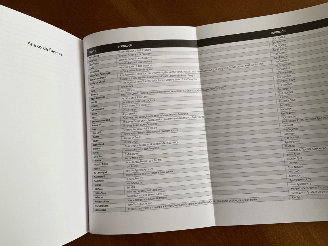
“Legibility and typography: the composition of texts” (Legibilidad y tipografía: la composición de los textos) is the new book by Horacio Gorodischer and José Scaglione that deals with these questions and exhorts readers to challenge everything they know about typesetting.
Released in November 2020 by Spanish publishing house Campgràfic, “Legibility and typography” was received with excellent reviews by the specialized press that also recommended it for both students and seasoned professionals. For now it is only available in Spanish.


TypeTogether is an indie type foundry committed to excellence in type design with a focus on editorial use. Additionally, TypeTogether creates custom type design for corporate use. We invite you to browse our library of retail fonts or contact us to discuss custom type design projects.