A jaunty, dynamic type family that stretches beyond one specific font category and use.
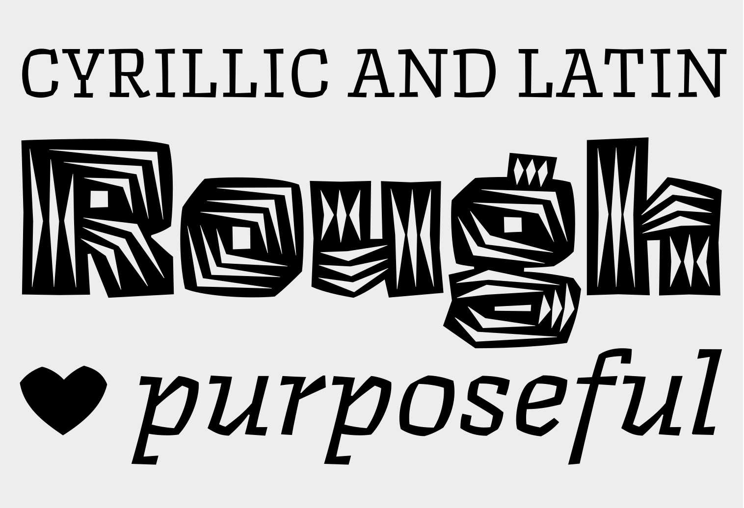
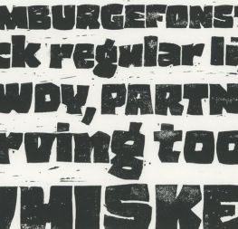
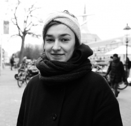
Nothing is hidden in the simplistic forms and overt aesthetic of Anya Danilova’s Rezak font family. Rezak is not a type family directly from the digital world, but was inspired by the stout presence of cutting letters out of tangible material: paper, stone, and wood. With only a few cuts, the shapes remain dark and simple. With more cuts, the shapes become lighter and more defined, resulting in a dynamic type family not stuck within one specific category.
The Black and medium weights began as one approach before separating into display and text categories. The four text weights were created through pendulum swings in design direction that experimented with contrast, angles, tangent redirections, and the amount of anomalies allowed. The tech-heavy Incised display style came last, employing a surprising range of trigonometric functions to make it behave exactly as desired. Its look can result in something distinctive and emotional or completely over-the-top.
Most normal typefaces change only in thickness; Rezak changes in intention, highlighting the relationship between dark and light, presence and absence, what’s removed and what remains. Rezak’s Black and Incised display styles are perfect in situations of impact: websites, headlines and large text, gaming, call-outs, posters, and packaging. Try these two in logotypes, complex print layering, branding, and words-as-pattern for greater experimentation.
The text styles are bold, energetic, well informed, and round out the family with four weights (Regular, Medium, Bold, Extrabold) and matching italics for a family grand total of ten. These jaunty styles work well in children’s books, call-outs, movie titles, and subheads for myriad subjects such as architecture, coffee, nature, cooking, and other rough-and-tumble purposes.
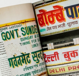
Rezak was conceived and released with Latin and Cyrillic scripts side by side. To wit, the word ‘rezak’ (резак) means ‘cutter’ in Russian and several other Slavic languages. Rezak Cyrillic takes its multilinguality one step further, including support for underrepresented languages such as Abkhaz, Itelmen, and Koryak.
Rezak Armenian is a respectful interpretation into the Armenian script, made in close consultation with Yerevan-based type designer Gor Jihanian. Its design hews closely to the logic and tradition of Armenian letterforms while maintaining Danilova’s original vision. Rezak Armenian stands up well side-by-side with its Latin, Cyrillic, and Georgian variants.
Rezak Georgian accomplishes a rare feat – a digital typeface that truly gives the impression of hand-cut tangibility. Its respectful interpretation into Georgian – in close consultation with the Tbilisi-based type designer Ana Sanikidze – honours the alphabet and its letterforms while still maintaining the original design approach that makes Rezak such a compelling typeface.
Together, Rezak’s multiscript support provides designers with a wide variety of weights and scripts, and its deftly tactile nature will be appreciated in a wide variety of contexts.
CREDITS
Lead design and concept
Anya Danilova
Supervision
Veronika Burian
José Scaglione
Engineering
Joancarles Casasin
Quality assurance
Azza Alameddine
Consultancy and proofreading
Vera Evstafieva (Cyrillic)
Gor Jihanian (Armenian)
Ana Sanikidze (Georgian)
Graphic design
Elena Veguillas
Rabab Charafeddine
Felicia Priscillya
Héra Mahseredijan
Icon designer
Luciana Sottini
Motion Design
Cecilia Brarda
Copywriting
Joshua Farmer
Douglas Arellanes
Social Media Manager
Doug Arellanes
Proofreading
Héra Mahseredijan(ARMENIAN)
Ana Sanikidze (GEORGIAN)
Vera Evstafieva (CYRILLIC)