GNT
April 2011
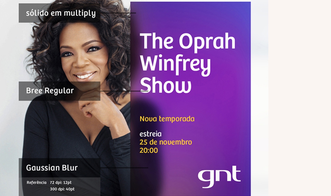
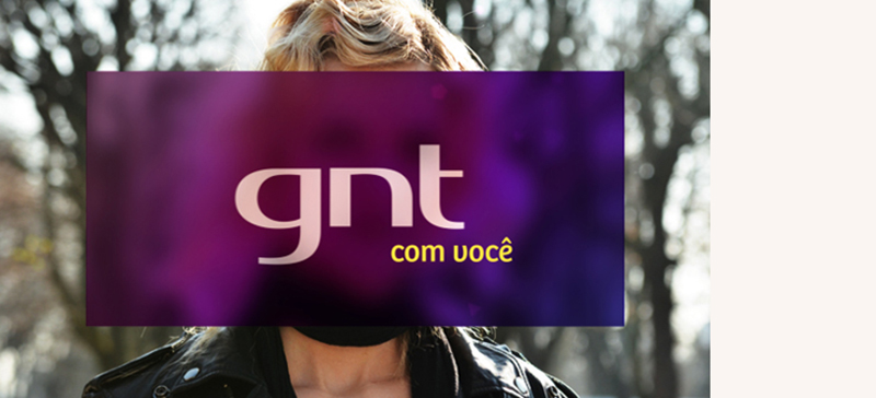
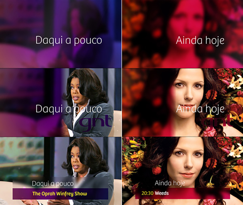
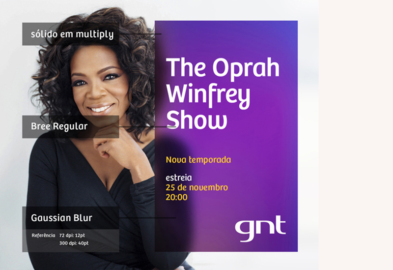
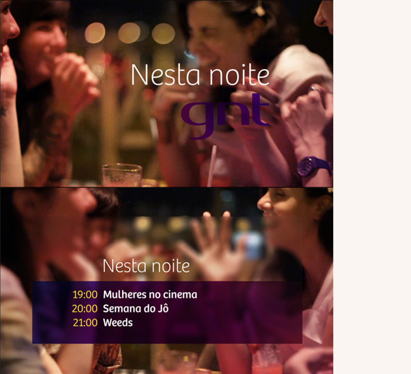
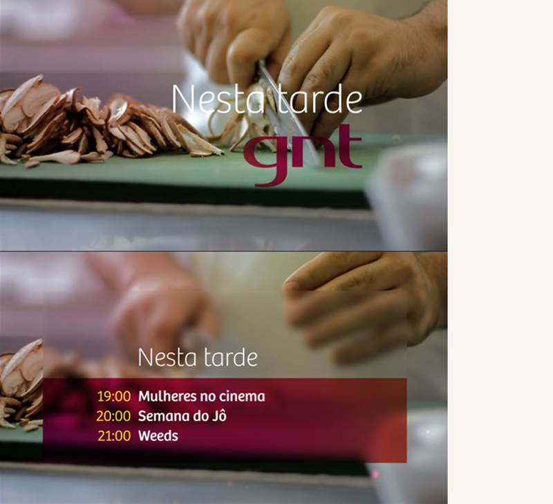
Bree in use in the Brazilian channel GNT
Bree in use in the Brazilian channel GNT
The Brazilian GLOBOSAT Network channel has adopted a new programming structure as part of its rebrand. Contrasting to the clean and elegant 2008’ on-air look, the new GNT channel identity should be designed to get closer to Brazilian modern woman. The in-house creative team was commissioned to develop a whole new design image more in-tune with the audience of “AB-consumerclass-woman-30-years-old-professional-contemporary-and-mother”. They chose Bree as their main identity typeface. Creative director Ricardo Moyano says: “The typeface we choose had to follow the same premises. In this sense, Bree typeface suited on the general concept in a very elegant way. The rounded shapes suggest all femininely we expected to present. Also when composed in sentences and headlines it flows as a handmade calligraphy. It looks at same time unpretentious and sophisticated; exactly as GNT women audience wants to be.”
See the movie reel here.
Full Credits
Art Department Manager: Manuel Falcão
Creative Coord: Ricardo Moyano
Research: Marcio Leite
Photography Direction: Ricardo Moyano e Vitor Peixoto
Designers: Rodrigo Leme, Leon Vilhena, Daniel Tumati, Luke Bosshard, e Celina Arslanian
Sound Design: Jonas Sá
Production: Larissa Bello and Vanessa Barbosa
Approval: Letícia Muhana (Direction/GNT) and Daniela Mignani (Marketing/GNT)
TypeTogether is an indie type foundry committed to excellence in type design with a focus on editorial use. Additionally, TypeTogether creates custom type design for corporate use. We invite you to browse our library of retail fonts or contact us to discuss custom type design projects.