Rezak’s concrete soul: Anya Danilova interview

September 2022

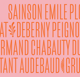
Anya Danilova ’s Rezak font family has a concrete soul dressed up in light-hearted clothes. It is readable and perfect for packaging, brands, children’s books, and in large formats like album covers, posters, call-outs, and gaming. And don’t forget the Black and Black Incised versions for the heaviest impact. We reconnected with Anya to see what kind of impact Rezak’s design and release had on her.


Rezak is your 2019 KABK graduation project. How much does the final Rezak family differ from the original version?
To me it’s almost two different typefaces! But to a normal person’s eyes I imagine it changed, but not that significantly. It evolved and became more elaborate, but I hope it still has its rough-cut soul.

During our first conversation two years ago, you mentioned you could tweak your typefaces forever. Are you satisfied with the final version of Rezak? Were you ready to let it out of your hands when it came time to release it?
I think most type designers feel that, “One cannot simply finish a typeface”. At the time of release, I wasn’t ready to let it out of my hands, indeed, but that’s where the external deadlines help a lot. If I hadn’t had a scholarship and a vague plan of “correct–test–publish” with it, Rezak would probably still be collecting dust in my archives and I would keep telling myself, “It’s not ready yet,” for the rest of my life. Publishing is a good staging point, like a “Push changes” option on git.


What was the thing that surprised you most during your Gerard Unger Scholarship?
The thing that didn’t surprise me but rather fascinated me and helped me most was the unity and support of everyone. There were tough moments for me that affected my work and deadlines — in those moments I got nothing but support from all the people from TypeTogether. And with external support, it’s usually easier after a fall to stand up and start again.


Since you mention the team, the work of font engineers is enormous in every type design project. Was this also the case for Rezak?
In terms of a family size and styles system, Rezak is not really a complicated project. But it does have crazy outlines: there are more nodes that don’t align horizontally or vertically than nodes that do. So from the technical point of view, my work with outlines is a horror that I knowingly forced in order to have a vivid feeling within the characters. So there was quite some engineering work done there indeed.

Speaking of font engineering, I’d like to give a shoutout to people who helped me with that side the past few years. Joancarles Casasín, the TypeTogether font engineer, was the person to face all of the accidental and not-accidental weird issues in Rezak and deal with them. He helped me a lot with small but efficient scripts to solve the local problems in my fonts.

Ryan Bugden, Just van Rossum, and Roberto Arista helped me at different times with the script I made during my studies for the Black Incised version. Without their help I would probably still be working on that style. Their scripts saved me an enormous amount of time.

When you look back at the whole process of transforming a student project into a commercially successful product, do you think you would have been able to finish Rezak on your own? Is a font’s design and production even meant to be done alone?
It certainly can be a one-person work, the question is how self-sufficient this person is. I can be lazy if it’s only up to me; I sometimes clean my apartment only if people are coming over. I enjoy working together with people on a project and it also gives me the necessary push to get the work done.

The release of Rezak stirred the design waters quite a bit. Designers mentioned that Rezak brings fresh air to the TypeTogether library. What is the main contribution or what gap does Rezak fill in the TypeTogether library?
I think we might need to wait for some time, when there’s more of an understanding on how Rezak is used. But honestly, I think this was a leap of faith for TypeTogether on behalf of Rezak. You might be tempted to call it just a peculiar display type family because of its character, but the work and treatment was comparable to a work on a “serious” text type family. And I think Rezak’s text styles work well in relatively long texts while its display styles are there to make the loudest titles. So just bringing it to the TypeTogether library feels like a little bit of a countercultural move which comes with a certain level of risk — and of course I really appreciate that!


Many of our readers don’t understand how culture and typography intersect in Russia. Could you tell us a bit about it and your decision to support minority Cyrillic languages?
I want to take a moment to try and explain an issue that highlights a cultural conflict here. Cyrillic is the name of the alphabet used in this part of the world. Russian is only one of many languages using the Cyrillic alphabet, just like Latin is the basis for English, French, German, Spanish, Portuguese, and many more.

So while Russian is the official language, there are 37 co-official languages in regions throughout Russia. The attitude toward these minority languages using Cyrillic is indeed imperialistic. Though there are many typefaces now that support languages like Abkhaz and Chukchi, most people in the territory of Russia are using and speaking Russian while forgetting their own language. The “native” culture in a region is getting absorbed by the “official” Russian. Eventually the minority language stops being used, is forgotten, and the typographic side is one of many things lost as a culture.

When it comes to designing Cyrillic, the Basic Cyrillic set covers all the major languages that are spread around Eastern Europe. Meaning, if you create Basic Cyrillic typefaces, you should make sure it will work well in, for example, Ukrainian, Bulgarian, and Serbian. More than that, I also tried to cover all the Extended Cyrillic character set so the languages people might not even know exist could be typeset as well.

On the one hand, there are so many glyphs not covered by Unicode, while there’s like five different Unicodes for a circle. On the other hand, even if they are included in the typeface, people don’t use certain glyphs because they don’t know about them or it’s easier to copy something from Latin. There is some sort of miscommunication happening, creating a huge gap between culture, information, the professional side of design, and people.


The release comes during very difficult world circumstances. Is there anything special you would like to see Rezak used for in this new context? What would be your “dream use” for Rezak?
I appreciate this question because I feel like we need to keep talking about the Russian attack on Ukraine everywhere — even while releasing a typeface — so that it remains fresh and urgent instead of becoming dismissed. Apart from all the horrors war brings, it opens the old wounds of how people and countries with power devour whatever they desire, spread imperialistic values, and attempt to rule through threat, force, or death.

While type design might not be the best field to speak out, I want to believe I can provide a tool for the voices that might not be as loud as they should be, for whatever reason. It would be an honour for me if Rezak would be used for that.

So my dream use would include preserving and actually using minority languages. In order to do this, I would love to have feedback on the character design of those languages in order to start filling in the gap.

Thank you, Anya, and we wish you the best with Rezak!


About Us

TypeTogether is an indie type foundry committed to excellence in type design with a focus on editorial use. Additionally, TypeTogether creates custom type design for corporate use. We invite you to browse our library of retail fonts or contact us to discuss custom type design projects.