La Triennale di Milano
May 2017
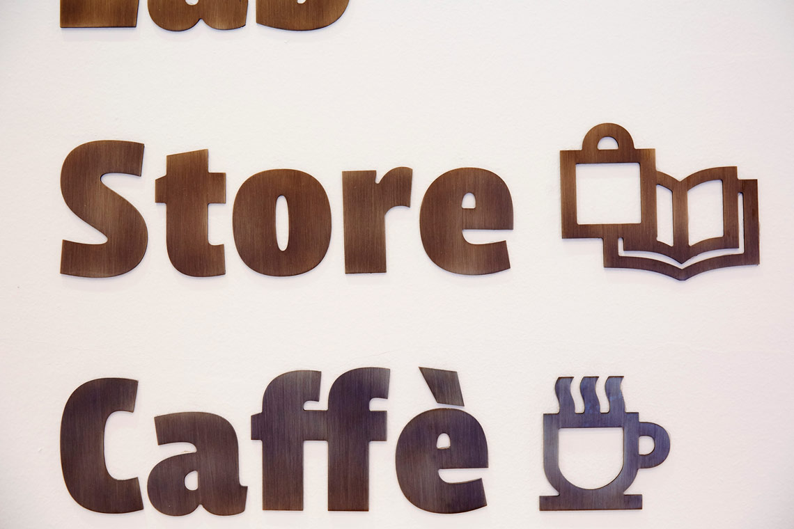
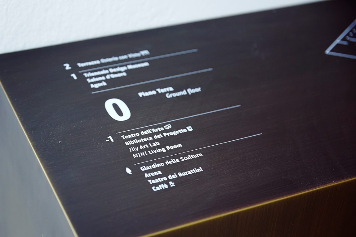
LFT Iro Sans, designed by Leftloft, in use for the signage of La Triennale di Milano.

LFT Iro Sans, designed by Leftloft, in use for the signage of La Triennale di Milano.
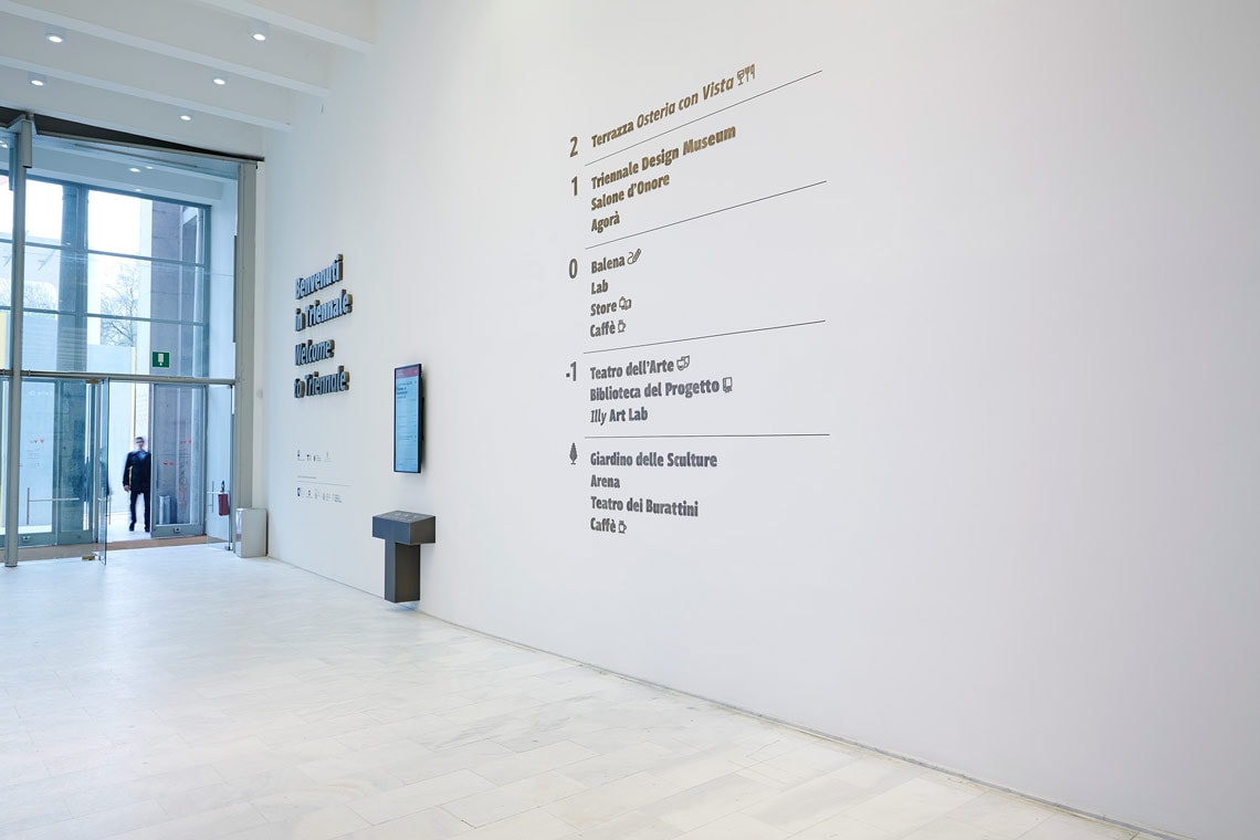
La Triennale di Milano is a centre for contemporary art, architecture and design. The building was built in 1933 by Giovanni Muzio, with the purpose of hosting the international exhibition on decorative arts, industrial arts and modern architecture, La Triennale di Milano, every three years.
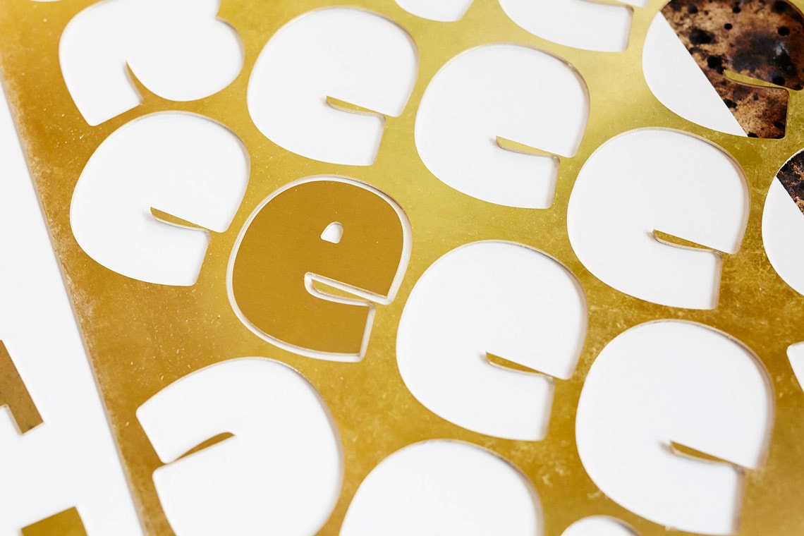
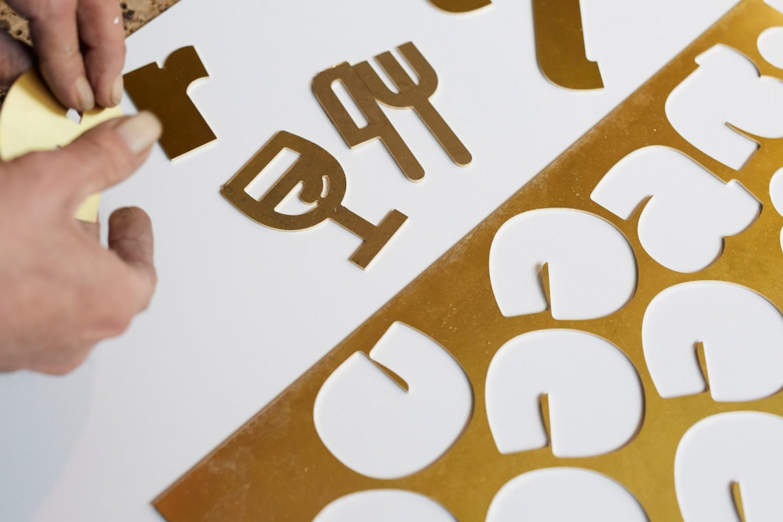
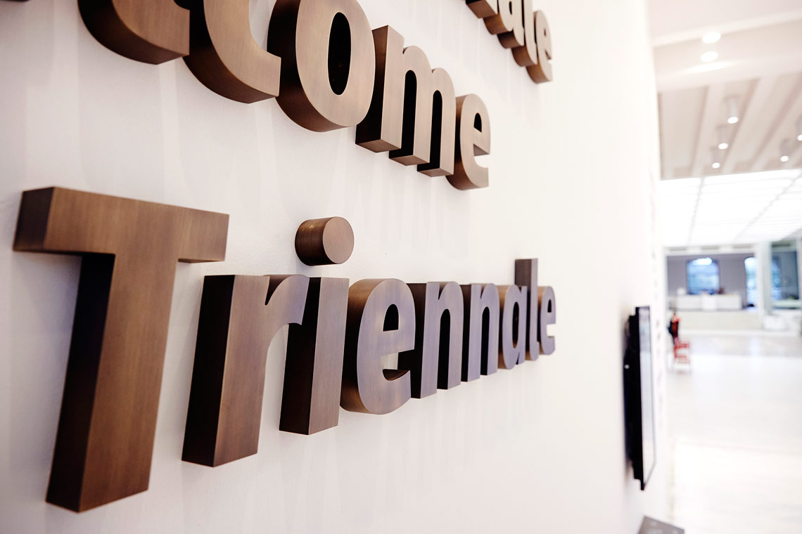
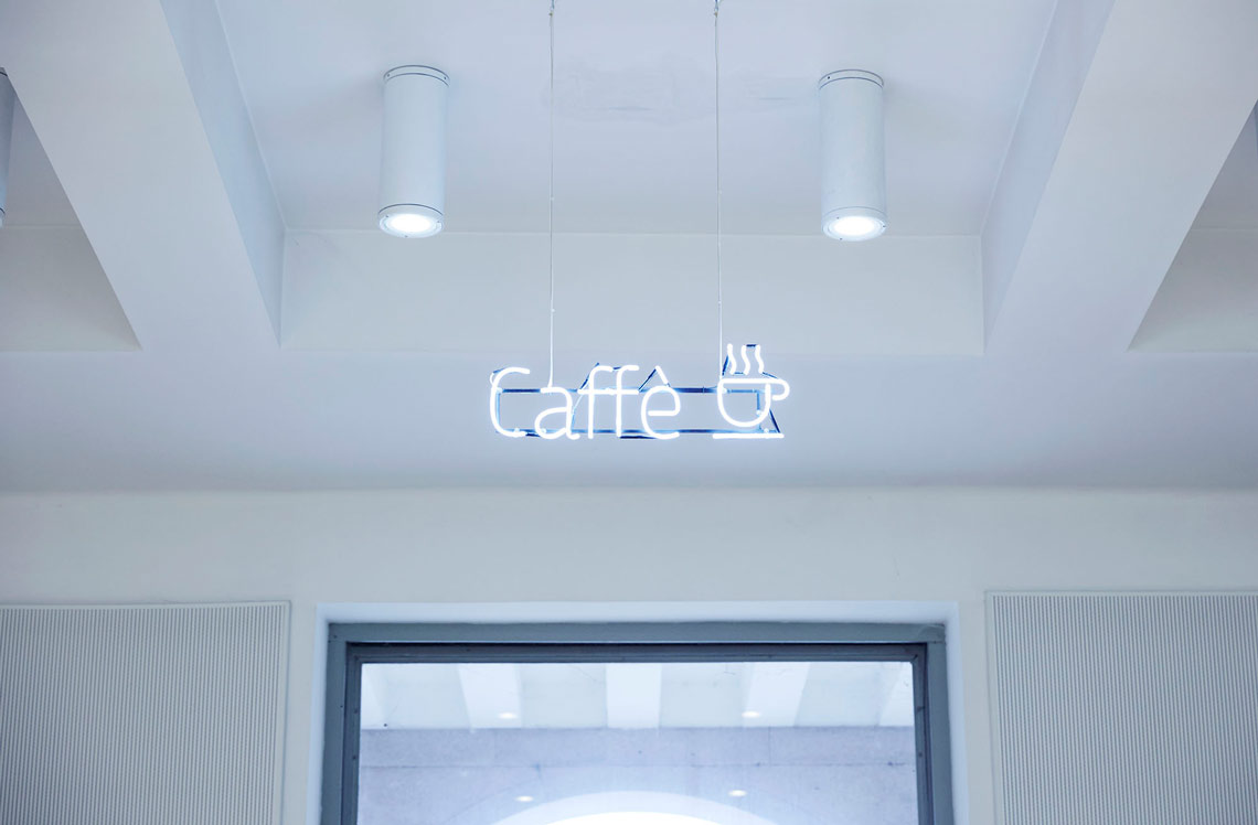
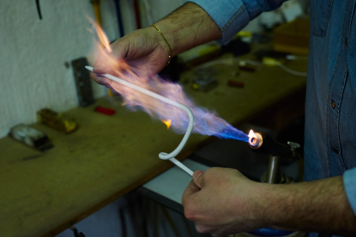
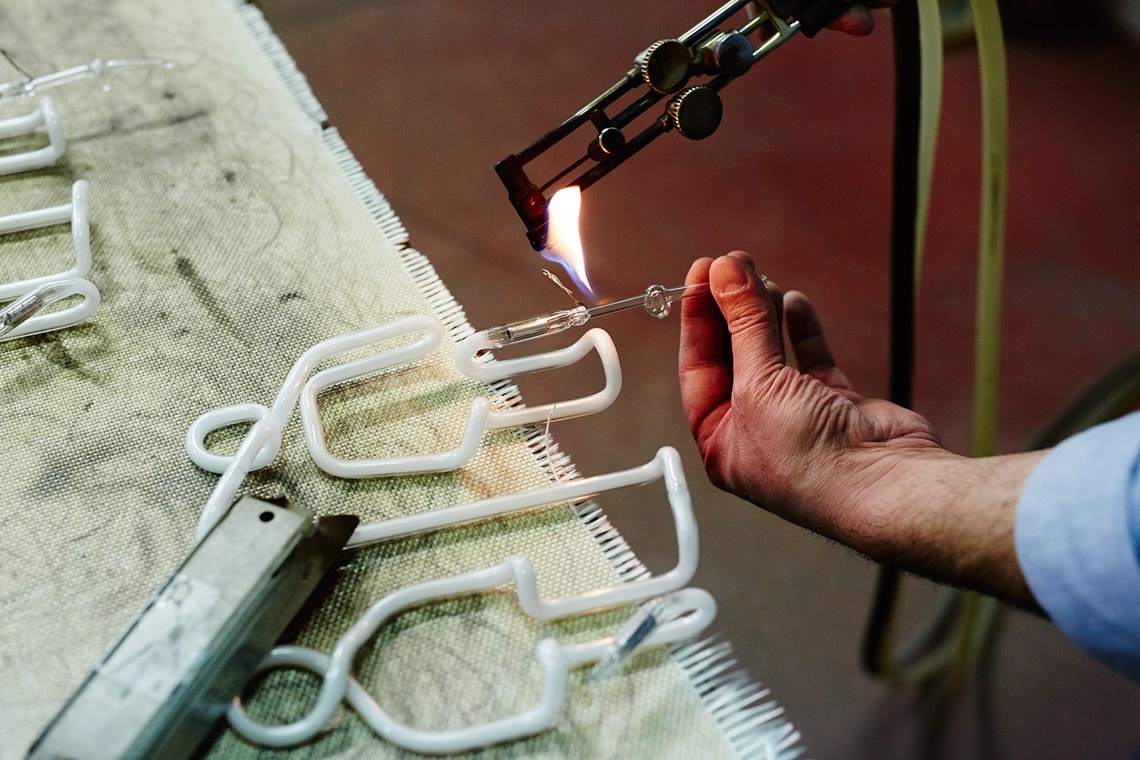
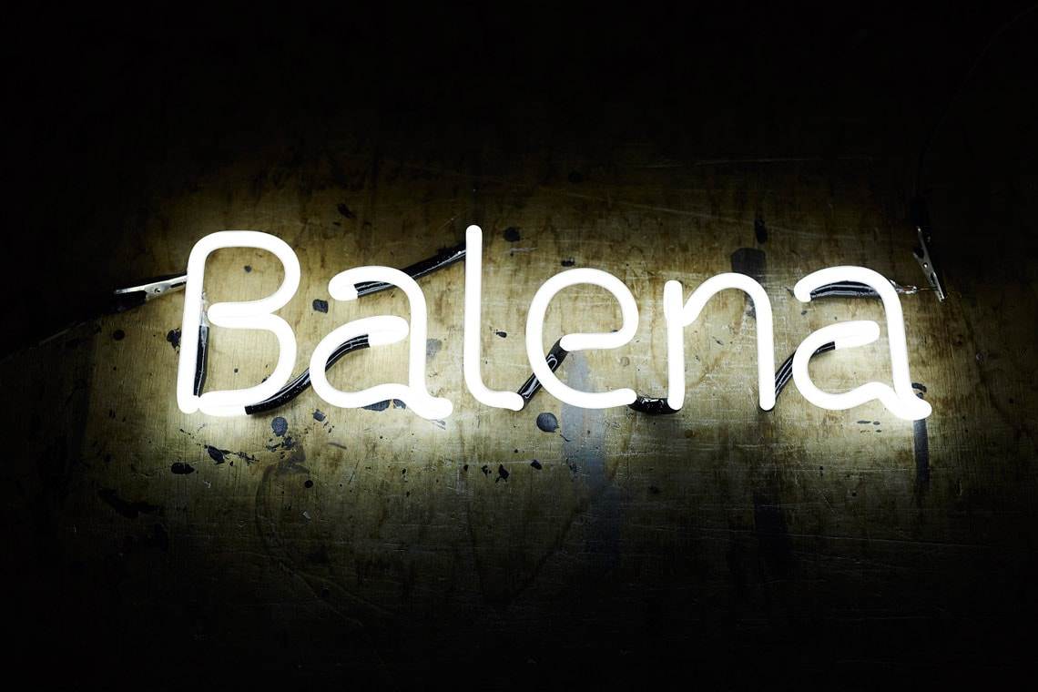
LFT Iro Sans, designed by the Italian studio Leftloft, is part of the permanent signage of the museum. The signage plays with different materials and sizes: three dimensional letters have been cut to welcome the visitors, flat metal letters are used attached to the walls, while neon letter signs and pictograms are placed to highlight some areas inside the building.
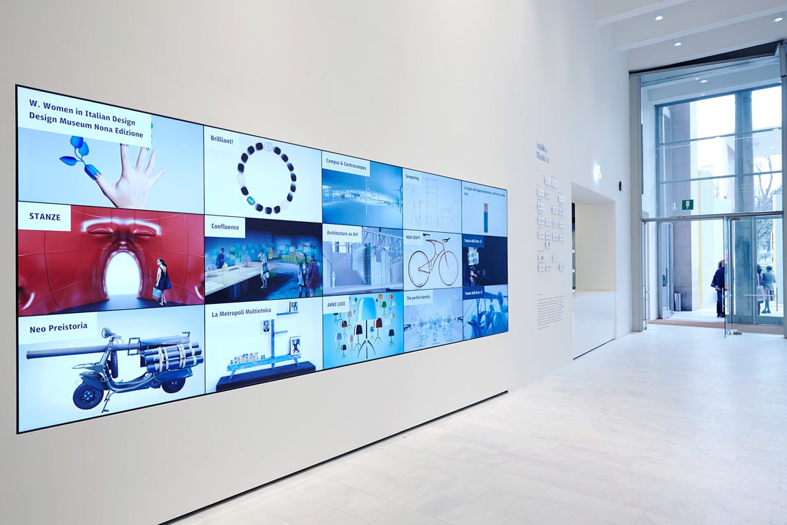
LFT Iro Sans strength lies in its ability to perform in different environments. The type family is also used in a wall-sized digital screen that offers information to the visitors when they arrive to the museum. With 30 different weights and styles LFT Iro Sans is an expansive family that solves the significant, wide-ranging challenges of branding, wayfinding, pictographic language, and complex editorial use for screen and print.
Photographs ©Tommaso Gesuato.


TypeTogether is an indie type foundry committed to excellence in type design with a focus on editorial use. Additionally, TypeTogether creates custom type design for corporate use. We invite you to browse our library of retail fonts or contact us to discuss custom type design projects.
Schedule an introduction meeting to learn more.