Literata 3.0: a full digital publishing toolbox

September 2020

The idea that fonts are changeless, static artifacts is still widely believed in the graphic design community. But it is a misconception, likely a legacy from the old movable type days. When fonts became digital files they acquired a level of flexibility that is a powerful tool when used correctly. Type designers can quickly create customized versions of their typefaces to meet any requirement from designers and developers. And more importantly, foundries can continue to improve, fix, add language support, or even change design features to existing font families. In other words, font software gets updated just as any other piece of software.

Literata, variable font, google fonts, free

fonts for electronic books

The new version of Literata should be considered more than a simple software update. But in order to understand the full scope of the changes we made, it is necessary to briefly revisit the original project.

Literata was commissioned by Google in 2014 for their Google Play Books reader (read the story here). At that time Apple had already added better fonts to their iBooks mobile app, including our own Athelas family, and Amazon had commissioned a new typeface for its Kindle devices. Major tech players understood two things: ebooks were here to stay, but the reading experience at that time needed significant help.

The brief was clear: Google needed a type family that would excel in continuous reading across a wide range of screens and pixel densities. As a result, the range of required weights was quite small; we only needed to design regular and bold with their matching italics.

We aimed for a rather dark regular weight and generous letter spacing, both features that proved very successful when tested on backlit screens. We also introduced the novel idea of having an upright italic in the Literata family. Not only did it solve many pixelation issues, it further cemented its recognisability as soon as the reader opened the application.


google fonts, free


The original Literata family supported Latin, Cyrillic, and Greek and featured a range of typographic niceties that enhanced book design such as small caps, oldstyle figures, ligatures, and much more. Literata, the original one, was a workhorse conceived, crafted, and engineered with a singular purpose in mind — typesetting digital books and editorials and reducing reading fatigue.

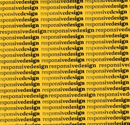
Adobe, Apple, Google, and Microsoft announced near the end of 2016 the extension of the OpenType format that we now know as “variable fonts”. This development is first and foremost a file compression tool. In a rather limited description, we could say it allows multiple styles to live inside a single font file, thus significantly reducing the bandwidth needed to serve type families through the Internet.

It was an absolute game changer — this can’t be overstated — and made it possible for Web typesetting to be as detailed and exquisite as printed type while using as little as one-tenth the size of the original font file!


literata‘s new brief

In all fairness, it must be said that Dave Crossland, Lead Program Manager for Google Fonts, foresaw that the Literata family could become a much broader typographic tool from the very beginning. He imagined support for more scripts and a wider range of weights, optical sizes, and even different grades. The variable font technology would boost and be able to contain all these features. According to Dave, now that we had a tool for file compression we could “grant expressiveness and improve text typography by means of finesse through optical sizes”.


Literata 3’s early design explorations and tests.


Our first task was to determine the new boundaries of the design space, so we used Literata Regular as a starting point for a new headline style. We sketched glyphs with increased contrast, slightly compressed lettershapes, and tightened spacing. We then did just the opposite for a caption style while also making the serifs much more robust and flat. After that we explored the extended weight range by sketching some extra-light and heavy characters.

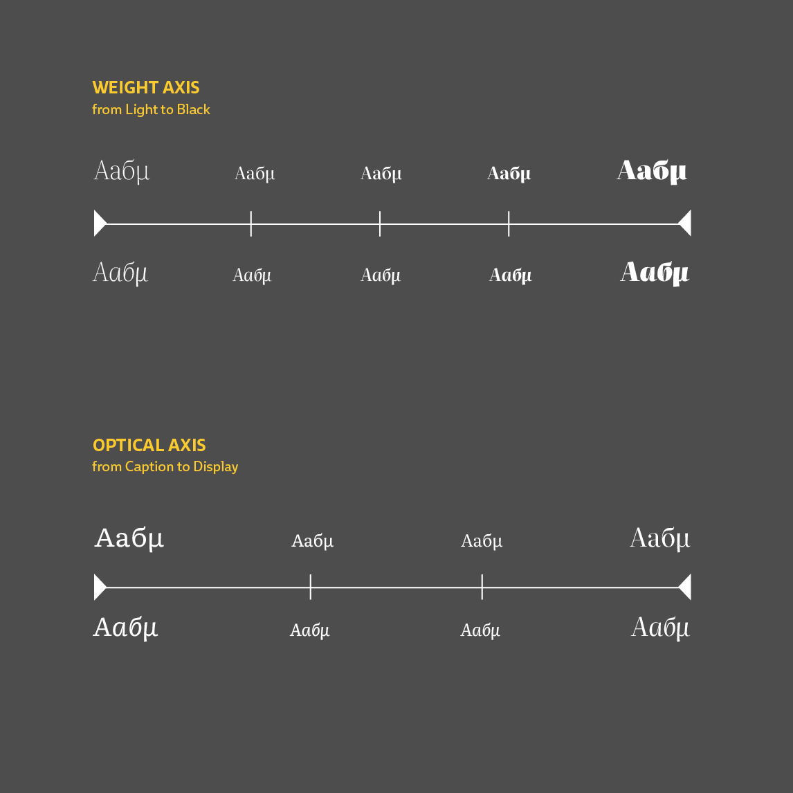
The two axes of weight and optical size and the newly designed extreme masters generate a “cross” that determines a theoretical rectangular design space. However, letters are delicate things and the mathematical interpolation of curves can quickly go wrong.


Literata design space axis


In real practice, the extreme edges of the rectangular design space rarely produce good results. Kinks, wrong modulation, inconsistent stroke weight, and incorrect stroke thickness are a few of the common issues when dealing with the design space’s corners. This can only be fixed by creating new masters that force the interpolation process to produce more efficient results.

So we decided to work with a two step process. We first created the four extreme designs to define the boundaries of both variable axes. In the second stage we added three of the four corner masters to improve control of the interpolation process.


literata 3.0: all-new & cutting edge

It should be clear by now that Literata 3 is no small upgrade — it is a full redesign within new technological bounds. Whereas the core part of this type family can still excel at text typesetting for continuous reading, the additional styles make this family a complete digital publishing toolbox. 

At this point most font foundries mention how many styles the family has. But is it helpful to compare the two versions only by their number of styles? No, probably not since there’s much more to the story.

OpenType variable font files allow the user to access endless styles within the design space, for example choosing any weight variation between the extra-light and the light. On the other hand, there is a big difference between the design variations that are accessible and the ones that are actually advisable after considering the family objectives. In such a case, history and typographic “best practices” should inform which weight range is recommended for each of the optical sizes. For example, extra-bold weights should never be used in caption printing sizes and thin typographic styles are not ideal for body copy.

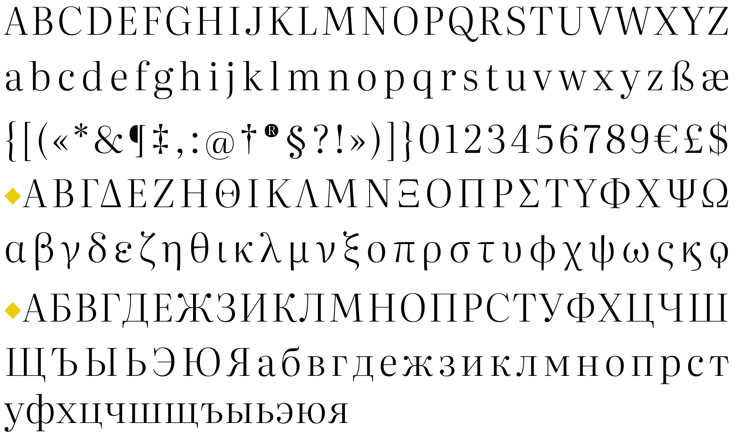
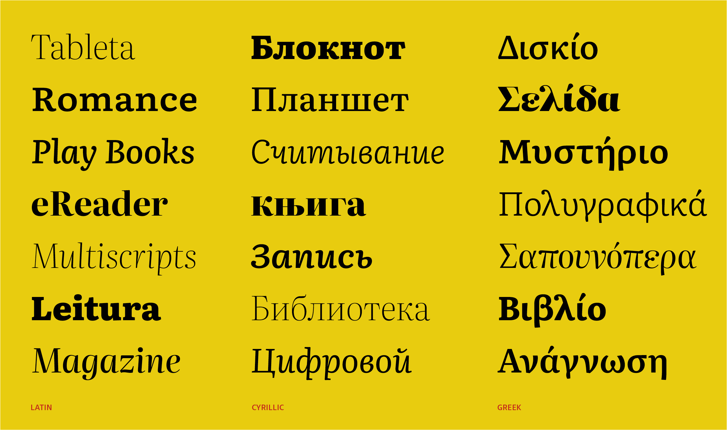
Literata 3’s static styles and recommendations for use. Note that the variable fonts contain all these styles, plus every possible style between these, within two single font files. The Black triangles indicate the drawn master styles.


Literata 3 is a typeface conceived for intensive editorial use, especially on screens of all sorts. Its main potential is in digital publishing, whether on the Web, electronic press, or mobile applications. You can set entire books, magazines, apps, and newspapers in this one typeface, all while using less bandwidth than you’d ever dreamed. These are areas where visual communication is arguably still in its infancy and where many technical and cultural challenges remain, but also many possibilities.

We created Literata 3 understanding the current state of the art in digital publishing, but one of the best things about making fonts is that our creations tend to develop a life of their own. It is impossible to predict what amazing things talented designers will do with our typefaces. Designing Literata was a great challenge and an incredible opportunity to provide a solution through engaging, adept, and sensitive multiscript typography.

Thanks to Google’s OpenFont License (OFL), Literata 3 is free to own and use — yes, the entire family has no strings attached! This wide-ranging family of two variable fonts is loaded with everything you’ve come to expect from a pro-level typeface, including support for Greek, Cyrillic, PinYin, and Vietnamese.

We invite you to download it, experiment with it, and use it to your heart’s content. Designed with the future in mind, Literata will serve you well for years (or decades) to come.


About Us

TypeTogether is an indie type foundry committed to excellence in type design with a focus on editorial use. Additionally, TypeTogether creates custom type design for corporate use. We invite you to browse our library of retail fonts or contact us to discuss custom type design projects.