Aneto in progress

December 2020

Meet Aneto, a new serif font that is currently on the drawing board, and the last in a trilogy of self-initiated TypeTogether projects. We are working hard to release this new type family before the end of 2021, but for the time being, sit back and enjoy these first sketches.

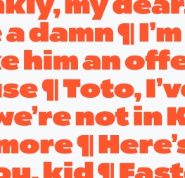
 

In 2017 the TypeTogether team had an internal discussion about eclecticism in graphic design, meaning pairing typefaces that were not intended to go together, but somehow work incredibly well as a whole. At the time, Veronika and José had attended the Typographics conference in New York City where Gail Bichler presented the New York Times Magazine redesign, which is arguably an amazing playground when it comes to typographic eclecticism.

The idea, however, is not new, and we have always strived to create font families that would work well together, even if their design DNA is quite different. This found an immediate fanbase with editorial designers around the world who, instead of waiting for exactly matching sans and serif families, opted to successfully pair Ronnia and Karmina (like Interrobang magazine), or Abril and Tablet Gothic (De Telegraaf, ZB MED – Leibniz Information Centre for Life Sciences).

Historic samples, especially from the early 20th century, show fonts being paired freely in both posters or editorial pieces, even though it could be argued that the more limited typographic options may have forced this to occur. Regardless why it occurred, the results were very good in some cases and very interesting in others. That typographic approach is quite opposite to certain design mainstream trends from the ’90s and ’00s which tackled complex design pieces with a typographically homogeneous approach. If there was a serif, it had its exact sans counterpart.


Our discussions led to brainstorming and brainstorming led to ideas. That is how we decided to develop three font families for multi-platform editorial use that allow for graceful combinations in a variety of scenarios. The three families are Catalpa, released not long ago, Belarius, a 72-style family fully inspired by variable font technology, and Aneto which we are happy to now present for the first time.

Each family has its own DNA, its own unique purpose for existing. And together these three families will be able to completely set a magazine, newspaper, book, or any editorial format your heart (or client) desires! All three will have the normal static font files and also be released in the variable font format for infinite control and easy deployment with tiny file sizes. Enjoy the sneak peek!


About Us

TypeTogether is an indie type foundry committed to excellence in type design with a focus on editorial use. Additionally, TypeTogether creates custom type design for corporate use. We invite you to browse our library of retail fonts or contact us to discuss custom type design projects.