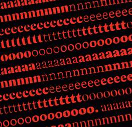

There’s something mysteriously difficult and magically satisfying about finding the perfect font pairing. For everyone who has struggled with pairings that really work, we introduce this discount bundle: the entire Temaraire family and the entire set of uprights in variable font format for our new Belarius family.
Temeraire harnesses historical serif influences for text and display and Belarius variable goes from sans serif to slab serif for perfect headings, subheads, captions, and titles. And the sizzling contrast between the two is where the magic really happens.
Want something with some gravitas? Use Temeraire in paragraphs and its Display or Italienne styles in large titles, and have Belarius pull duty in the middle weights, captions, and callouts. Want to edge more modern? Flip the roles and have Belarius Poster in everything large and either its serif or sans relative for all text. Temeraire will be a perfect high-class complement in callouts, overprint or knockout text, subheads, and captions.
With at least 50 styles from two hardworking typefaces, this deal has approachable tech, the beauty of contrast, small file sizes, and a wealth of options.
The discount ends 15 June 2021, so get the deal now before it’s too late!
Included in the offer:
- Temeraire Regular
- Temeraire Italic
- Temeraire Bold
- Temeraire Italienne Italic
- Temeraire Display Black
- Belarius variable font uprights: comprised of infinite styles along a spectrum in a single, super-small file. Five weights (Light, Regular, Semibold, Bold, Extrabold), three condensation levels (narrow, regular, wide), and three styles (sans, serif, poster).
TEMERAIRE
Based in English lettering traditions, Quentin Schmerber’s Temeraire rescues disparate styles from echoes in time. This serif font family is meant for beholding text in books, magazines, and large formats rather than being able to ignore it.
Temeraire serif font family was not designed to be invisible. It is a typographic exploration meant to be seen — with its beauty, one could even say beheld.


BELARIUS
Instead of getting 45 individual font files, you get one all-encompassing Belarius file that’s a fraction of the size, while including infinite upright styles. It’s a three-axis variable family that shifts from sans to slab serif, from condensed to expanded widths, and includes every possibility in between — literally, since it’s a variable font. Belarius opts for poignancy instead of the overly quirky nature of poster slab serifs.
What will you find in the bundle? Well, just one file, Belarius variable upright, which includes every possible upright style and weight, allowing you to fine-tune them using OpenType technology in software like Adobe Illustrator, Adobe Indesign, or Affinity Publisher. Belarius variable upright comes with the weight axis (from light to extrabold), the width axis (from narrow to wide), and the family style (from poster to sans).
Variable fonts are a new part of OpenType technology that allows typeface creators to design fonts, and users to organise and use them, in a more advanced way than was done in the past. Rather than having one individual font style per font file (i.e., extralight, regular, bold, or extrabold), variable fonts are one file with almost infinite choices within a single “design space”, the total boundaries for a typeface’s appearance. To learn more about variable fonts, read our article ‘Variable fonts at TypeTogether’.
About Us
TypeTogether is an indie type foundry committed to excellence in type design with a focus on editorial use. Additionally, TypeTogether creates custom type design for corporate use. We invite you to browse our library of retail fonts or contact us to discuss custom type design projects.
Schedule an introduction meeting to learn more.


