Edita

Designed by Pilar Cano. Released 2009.

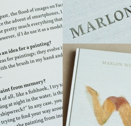
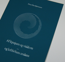
Edita is a contemporary book typeface with a soft and warm voice. It is humanist in concept, yet with a contemporary feel where softness and fluidity play a very important role. Edita is intended to be used complementarily in books where text is set together with photographs and other graphic elements.

  • Typography Served II, 2010
  • 2010 “Lletres de Barcelona”, Amiens
  • 2011 Communication Arts Typography Award

Shooting Opponents

Click to Edit
Change Font Settings

Australian lawmaker Bob Katter drew online complaints on Wednesday after posting a campaign video in which he shoots political opponents dead.

Click to Edit
Change Font Settings

The video, uploaded to his social media channels, features two men wearing shirts for Australia’s major political parties, the conservative Liberal Party and center-left Labor Party, putting up an “Australia for sale” placard. Seconds later the video cuts to a smiling Katter, blowing smoke from the barrel of a gun as the camera pans down to the two men apparently lying dead on the ground.

But the timing of the ad, just three days after gunman Omar Mateen shot dead 49 people in the worst mass shooting in modern U.S. history, drew sharp rebukes on social media.

Click to Edit

Katter, whose minor Australian Party focuses on issues related to rural Australia, denied that he was attempting to be deliberately controversial with the video. Australia is set to hold national elections on July 2.

“I’m not giving an explanation. You can go and watch the advertisement because it’s an anti-selling off Australia advertisement,” he told the Australian Broadcasting Corp. “It was just for humor value. But it was humor getting a message across.” That argument did not seem to gain much traction on Twitter, where users savaged Katter.

Click to Edit

The Backstory

Edita

A contemporary book and magazine font family with a soft and warm voice.

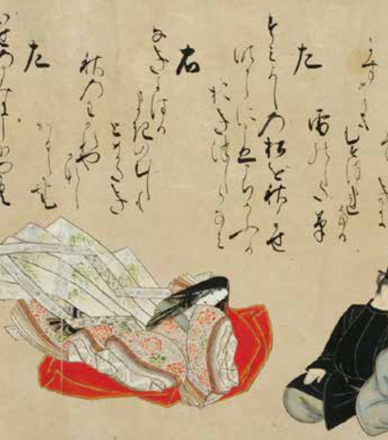
Edita is a warm font family by Pilar Cano, humanist in concept yet with a contemporary feel where softness and fluidity play a very important role. This is especially seen in its italics, which are loosely based on handwriting. Edita is intended to be used complementarily in books where text is set together with photographs and other graphic elements. However, it is versatile enough to be used in many other contexts, from novels to promotional material.

Edita’s large character set covers most languages which use Latin script. Its six styles give the designer the ability to work with a wide typographic palette, allowing complex typesetting with several levels of information. This is further enhanced by two optically corrected weights, Edita Small and Small Italic, which have been specifically designed for use in very small type sizes, such as in captions and notes. They differ by having a slightly taller x-height, heavier stems, reduced contrast, and carefully drawn inktraps to ensure legibility at sizes as small as five points. Additionally, their extenders are shorter to save space and allow text to be set with tighter leading.

The complete Edita font family comes in eight styles, speaks multiple languages, and, along with our entire catalogue, has been optimised for today’s varied screen and print uses.
About Us

TypeTogether is an indie type foundry committed to excellence in type design with a focus on editorial use. Additionally, TypeTogether creates custom type design for corporate use. We invite you to browse our library of retail fonts or contact us to discuss custom type design projects.