Alverata

Designed by Gerard Unger. Released 2014.

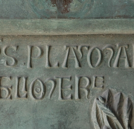
Alverata is a contemporary, eclectic font family inspired by type from medieval Europe. Capital inscriptions are the basis for this face, which can be seen in its short, thorn-like serifs and flared forms. Alverata also experiments with the characters themselves by exchanging straight lines for curves and vice versa, becoming resolutely modern in the process. Alverata performs beautifully in both digital and physical applications, delivering excellent openness and legibility in small text and proving lively and attractive at large sizes. Read about the background story here.

  • ISTD 2014
  • Typeface Design of 2014, Communication Arts
  • Rutenia 2014
  • Fontshop’s Best of 2014 
  • Typographica’s Notable Releases of 2014
  • Gold, 2015 European Design Awards
  • Honourable mention, Print Magazine
  • Yearbook of Type II, 2015
  • TDC Tokio: Type Design Prize 2016
  • 50 best typefaces,  étapes magazine 2014 
Alverata Set. 12 fonts USD 458,86
Change Font Settings

A history of role-playing games

Click to Edit
Change Font Settings

The roots of the modern RPG videogame can be traced back to the earliest tabletop games and beyond.

Click to Edit
Change Font Settings

By Phil Beresford
The exact moment when the RPG was born is debatable, particularly as the hobby of wargaming, which was a big influence on early role players, had been around in some form or another for hundreds of years. However, the first instance of what people today would recognise as a modern RPG came into being with the development of the tabletop game, Dungeons & Dragons in 1974.

Created by Dave Arneson and Gary Gygax and published by their company Tactical Studies Rules, it was a game that popularised many of the RPG conventions that are still being used today, such as character classes and abilities, races, experience and hit points (EXP and HP), levelling up, and turn-based combat.

Click to Edit

To play it, you needed a character sheet on which to record your stats, books containing the rules, monsters and scenarios, seven multi-sided dice, and ideally, a good imagination. Tackling a quest described in the scenarios, players would collectively decide how to deal with situations as they arose, with dice being rolled to determine things like combat, trap evasion and lock picking. It’s a template that has continued to serve the tabletop RPG ever since.

However, such a seemingly simple setup belied the game’s complexity, as the rulebook contained a wealth of detail that, if you were to enjoy the game to its fullest, had to be mastered by at least one of the players.

Click to Edit

The Backstory

Alverata

A contemporary, eclectic font family drawn from roots in Romanesque Europe.

Alverata is Dr Gerard Unger’s resolutely modern font family inspired by his doctoral research on Romanesque type in 11th and 12th century Europe. Capital inscriptions are the basis for this face, which can be seen in its short, thorn-like serifs and flared forms. Alverata also brings in secondary considerations from the early 20th century model, but tweaks them to prevent blandness and imitation.

Alverata stretches conventional letterforms without disturbing readers with unfamiliar details. Its primary Romanesque forms are robust while refinement is shown through myriad details, such as how the curves meet stems and how terminals of curves are resolved. Alverata comes in three styles to serve a wide audience (Regular, Informal, and Irregular), each with their own purpose and feel. The Regular sets the overall tone while the Informal style introduces an unexpected softness with such things as a single-story ‘a’ and calligraphic terminals.

The Irregular style is where real distinction lies because it’s made for scenarios where combining uniqueness with eclectic historical reference is the primary goal. Curved shapes prevail in the conventional Latin lowercase, whereas straight lines and angles dominate in the uppercase. Alverata Irregular exchanges these characteristics, experimenting with the characters themselves rather than increasing their weight or creating an accompanying sans.

The secondary characteristics of the early 20th century model, mentioned earlier, are seen mostly in details and familial relation: Alverata has a large x-height, is slightly condensed, and has large interior spaces within letters. By attending to these details, Alverata performs beautifully in both digital and physical applications, delivering excellent openness and legibility in small text and proving lively and attractive at large sizes.

To complete the Alverata family, Dr Unger collaborated with Gerry Leonidas (University of Reading) and Irene Vlachou (Athens) to develop the Greek version, and with Tom Grace on the Cyrillic version. All three styles of Alverata, along with our entire catalogue, have been optimised for today’s varied screen uses.

Read more about the background and development of Alverata as part of Gerard Unger’s PhD (2013) in our blog here.